
Articles
Design in the Fight for a Better World
16. August 2026

Granularity of Origin: Berlin Theses on Identity
10. August 2026
Latest news
Design in the Fight for a Better World
16. August 2026
Granularity of Origin: Berlin Theses on Identity
10. August 2026
Summer in Design Museum
8. July 2026
Newsletter
Exhibitions

I Can’t Get It Out of My Mind: Contemporary Slovak Design in Vienna
10. September 2026 – 11. October 2026

Summer Exhibition at the Design Museum
7. July 2026 – 30. August 2026
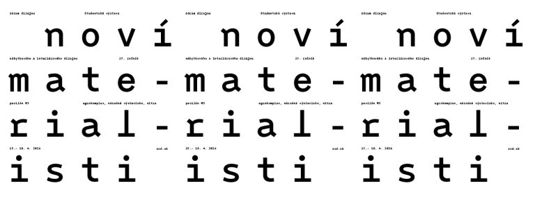
DESIGN FORUM 2026: New Materialists
15. April 2026 – 19. April 2026
Events

Lecture by Spanish designer Curro Claret at Slovak Design Center
Múzeum dizajnu
7. 10. 2026

Slovak Design Awarded Internationally 1.
19. 11. 2025
Slovak Design Awarded Internationally 2.
20. 11. 2025
Design Work
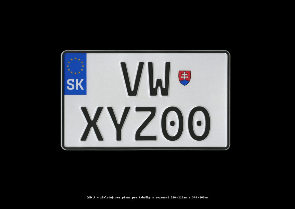
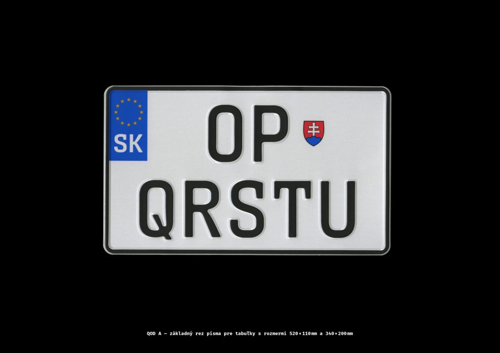
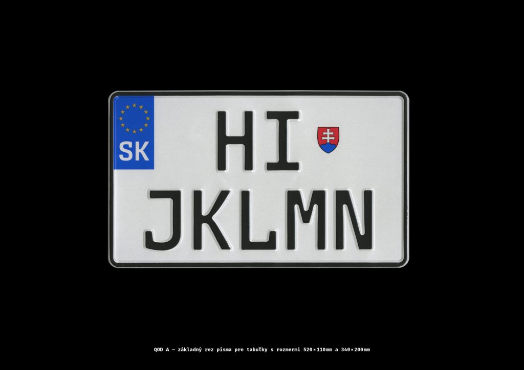
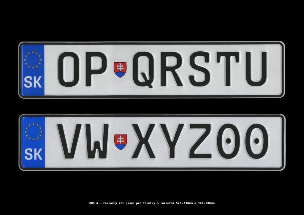
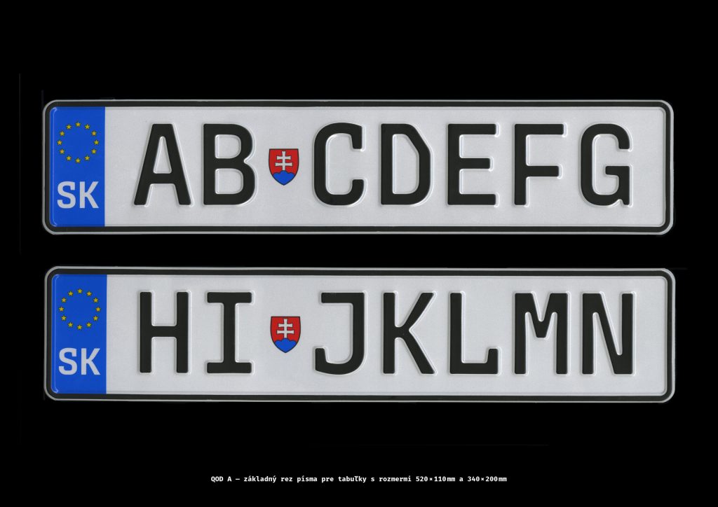
QOD typeface for car licence plates
The QOD typeface, derived from geometrically constructed sans-serifs, features uniform stroke thickness and equally spaced characters. License plate typefaces must have easily distinguishable characters, so QOD letters are more angular, and numbers are rounded. Easily confused characters like B, S, and 8 or O, D, and 0 are emphasized for distinctiveness. Selective use of serifs (C, G, I, J, L, S, T, 1, 7) enhances uniqueness. QOD has three styles (A, B, C), each designed for different plate sizes. The typeface was created at the Department of Visual Communication, AFAD in Bratislava.