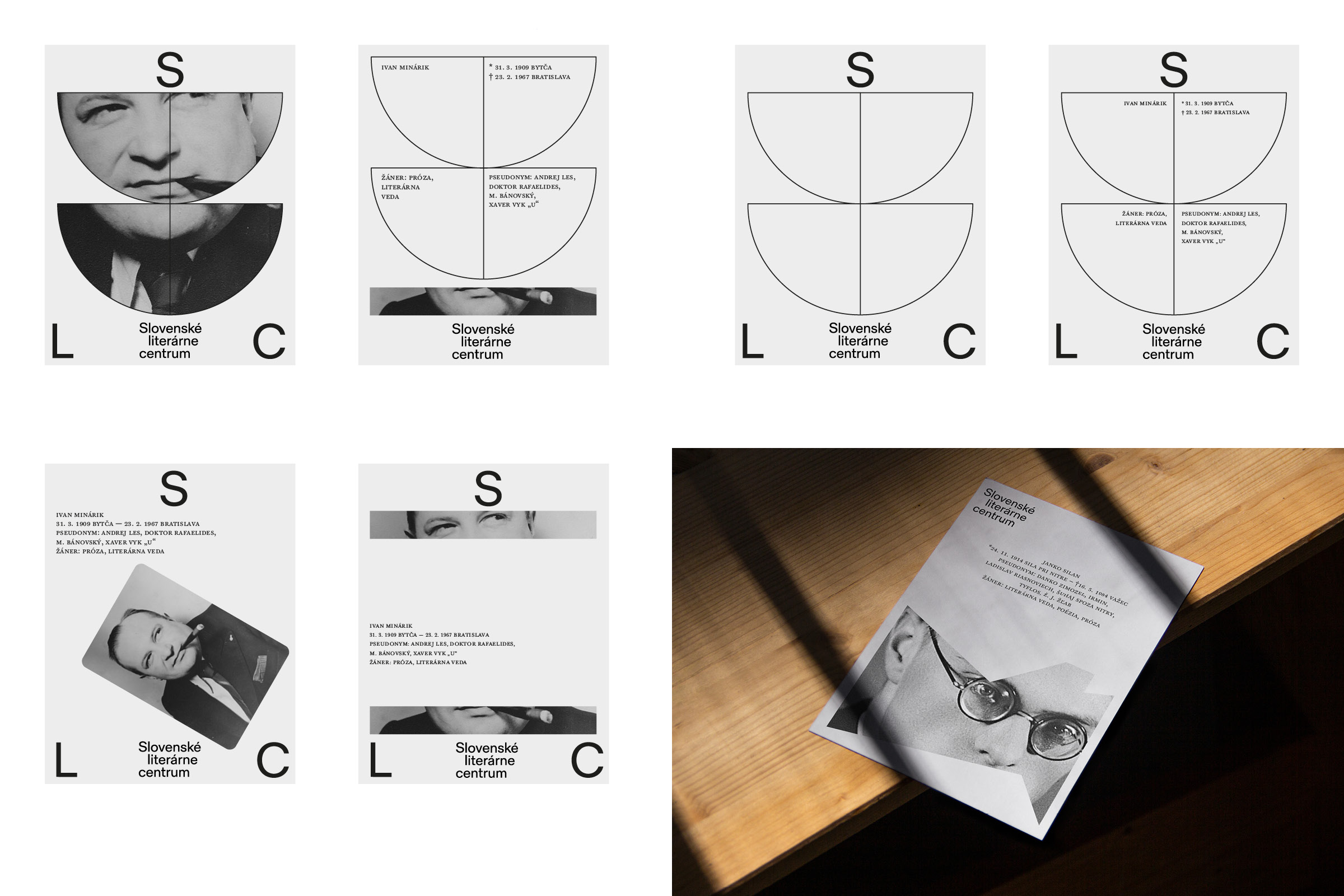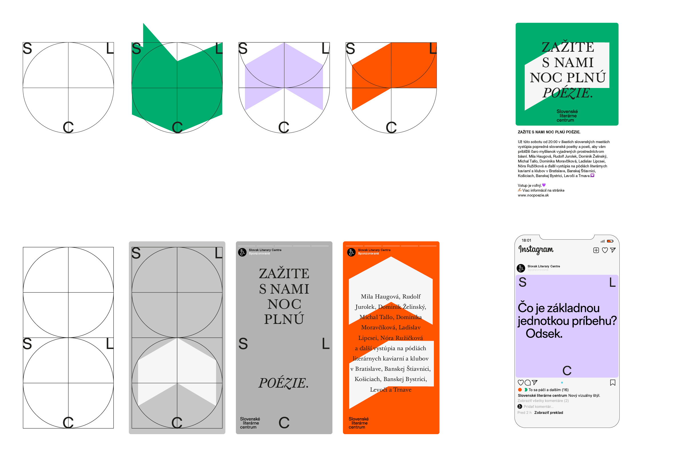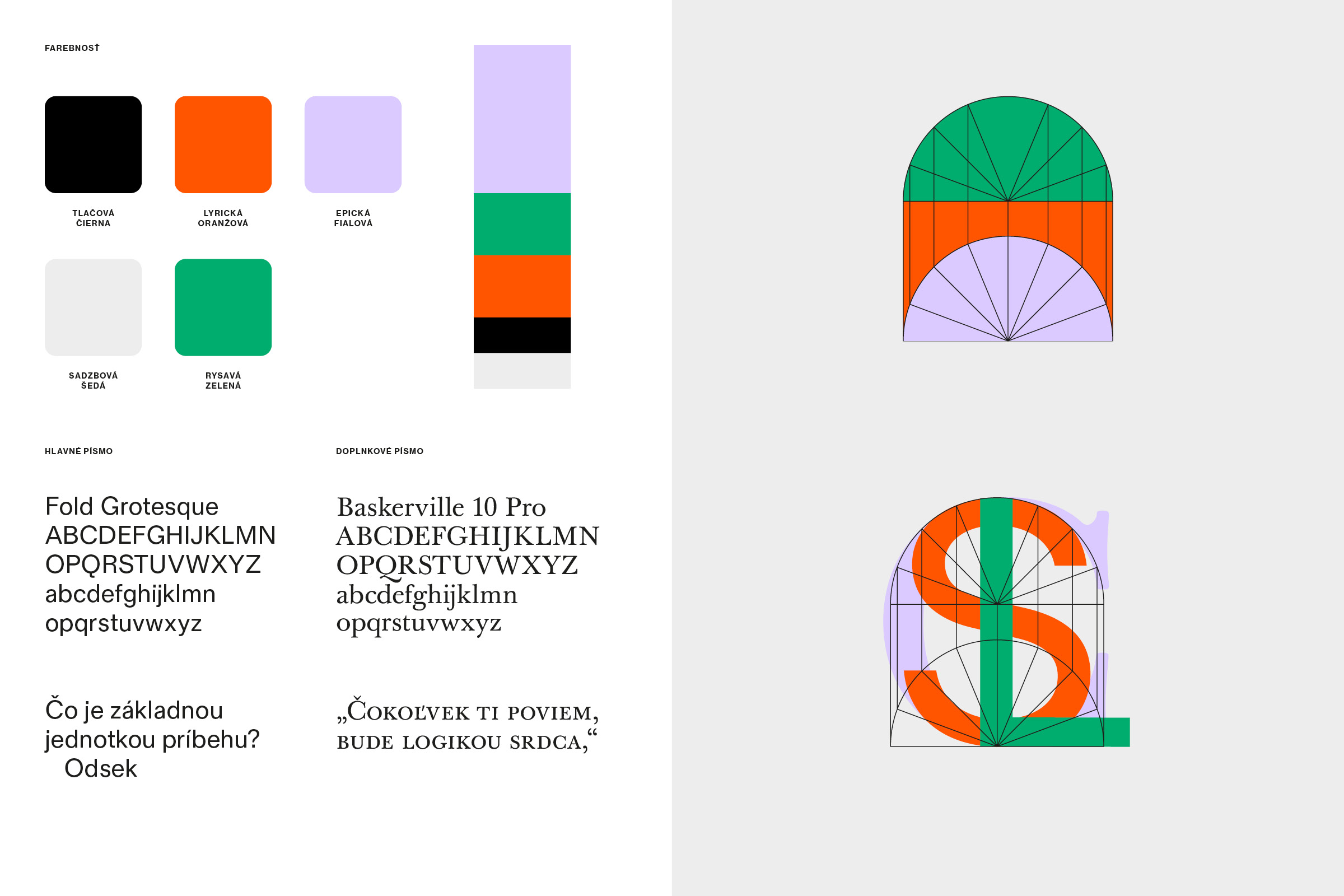


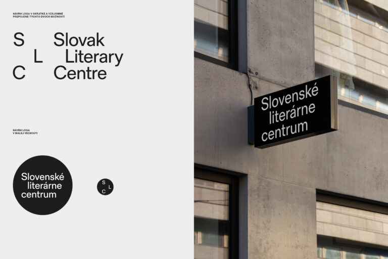
Slovak Literary Center

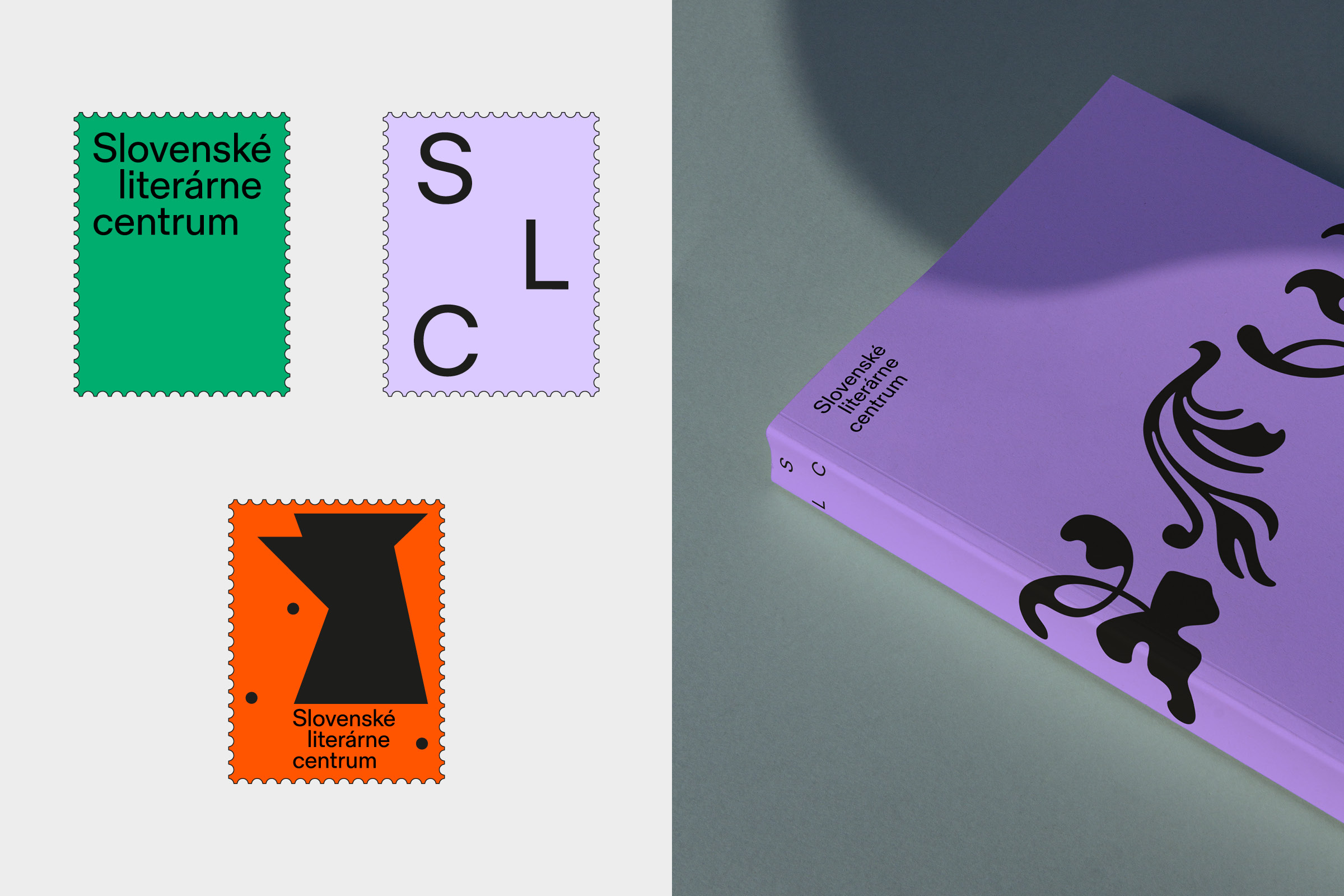
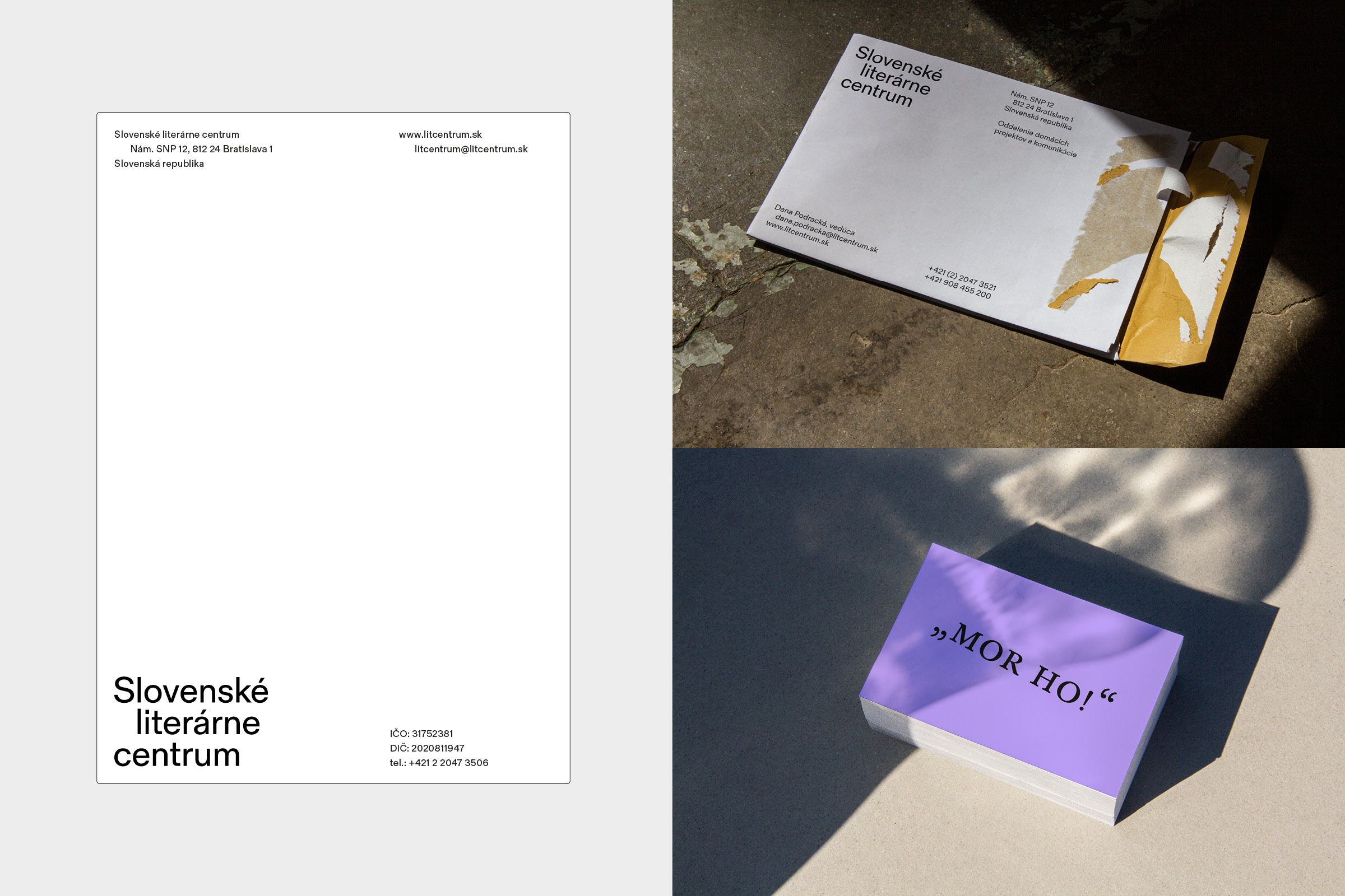
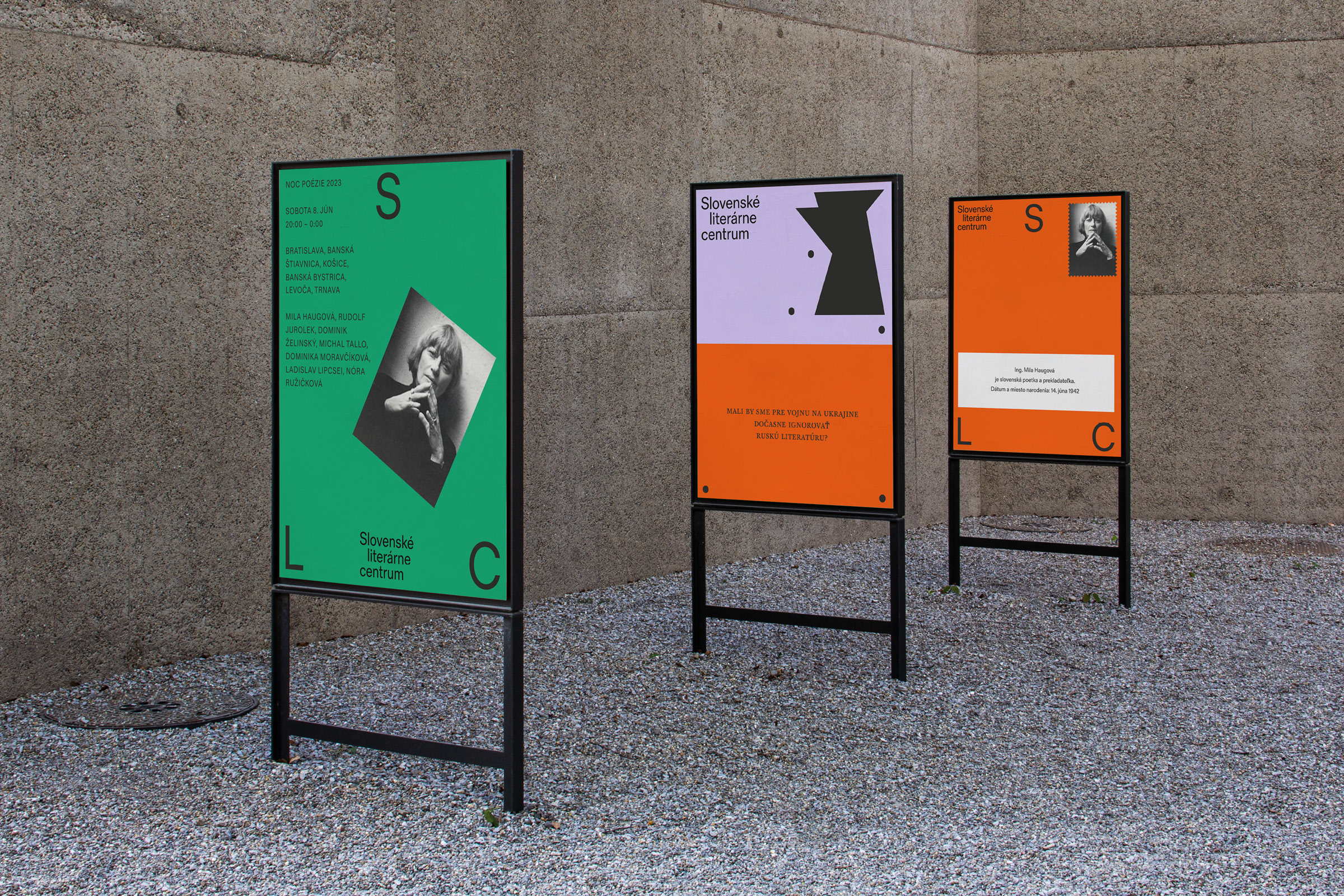
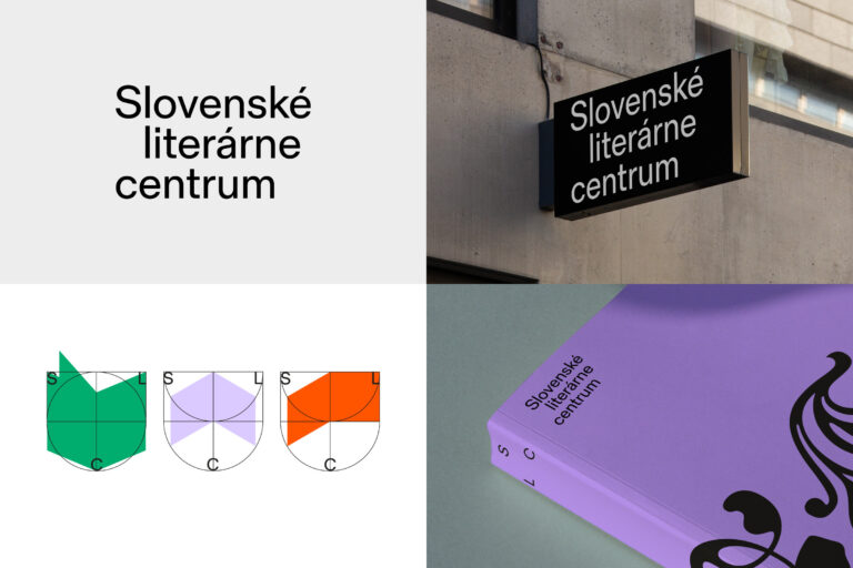
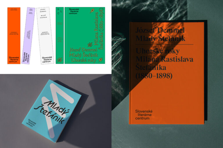
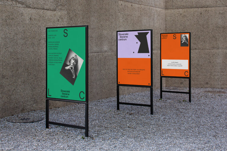
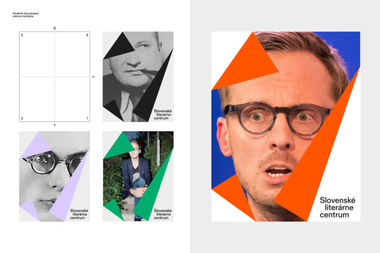
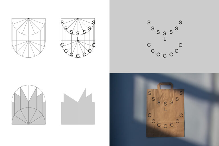
The renaming of the cultural institution from the original Literary and Information Center to the Slovak Literary Center necessitated the creation of a new logo and identity. The new logotype incorporates the paragraph as the fundamental unit of storytelling. The concept of the indent in the second line of the logotype evokes everyday work with text. The minimalist typographic logo is versatile, functioning effectively across various language versions, the SLC acronym, and different outputs such as books, flyers, printed materials, and digital platforms. The visual identity is inspired by the graphic notation of turning book pages, creating an imaginary visual grid of this movement from which full-color geometric silhouettes are derived. The new identity features a color palette of five shades: black, light gray, bright green, light purple, and orange.