



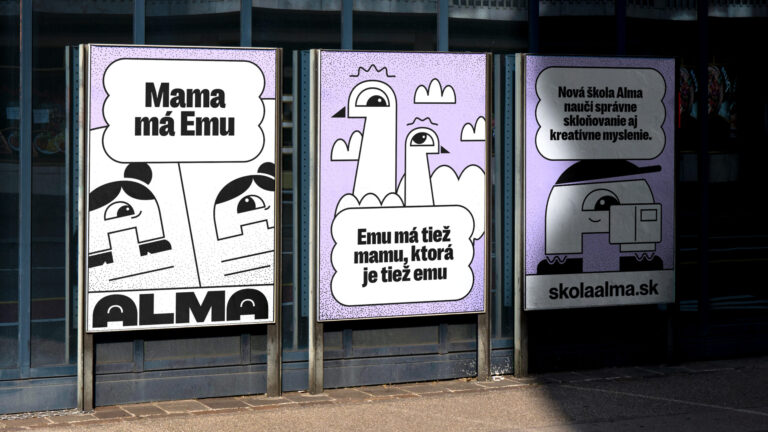
Alma. How Design Helped Save an Elementary School

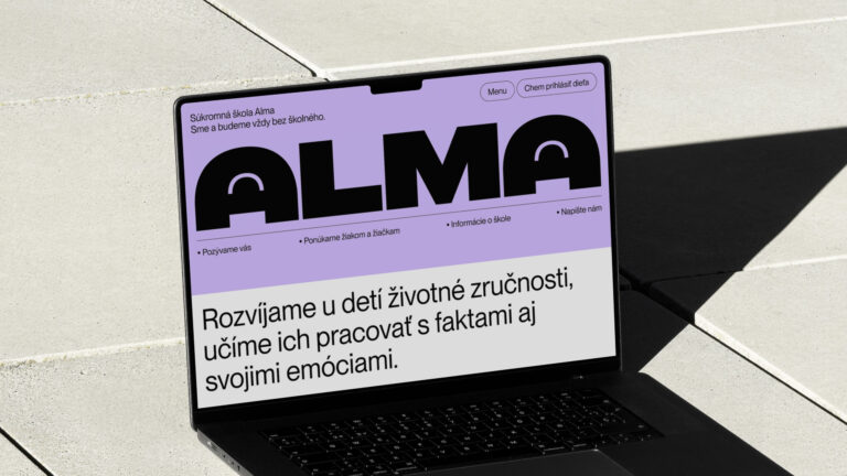
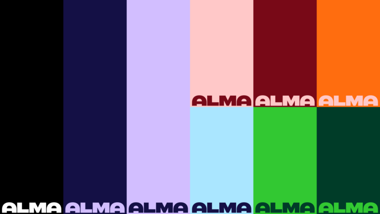
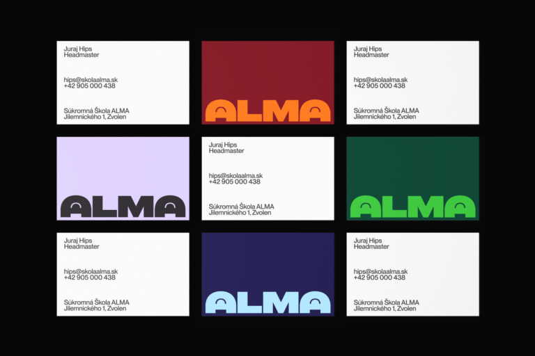
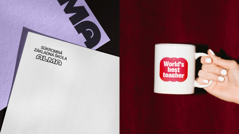
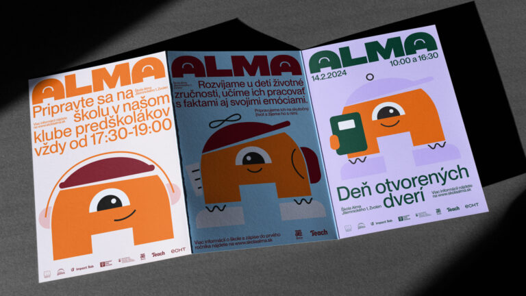
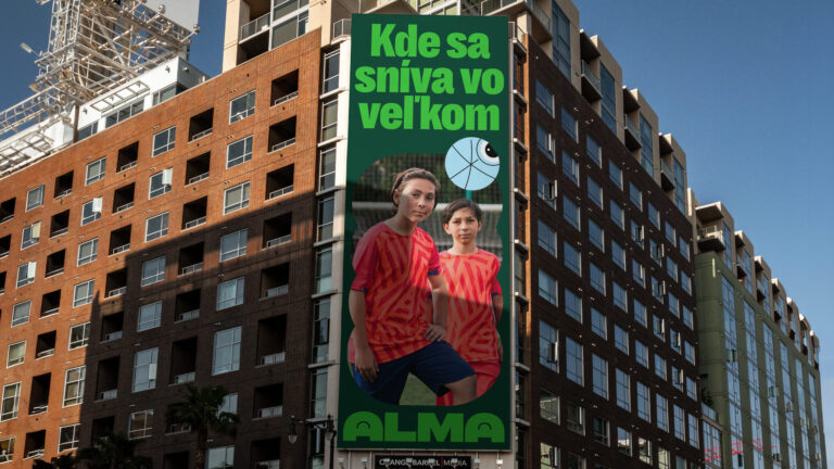
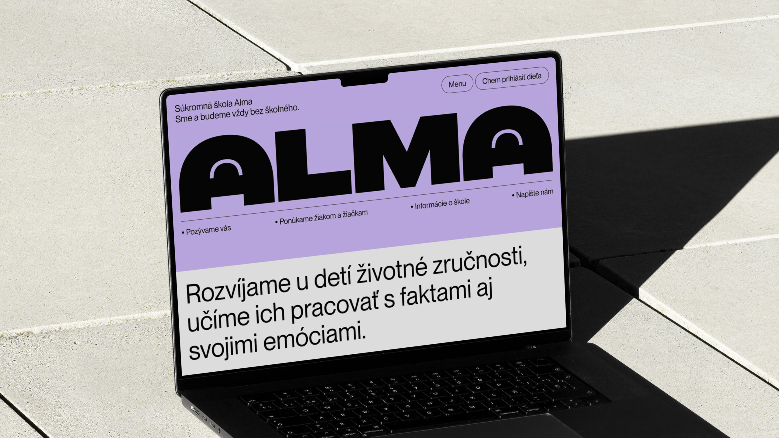
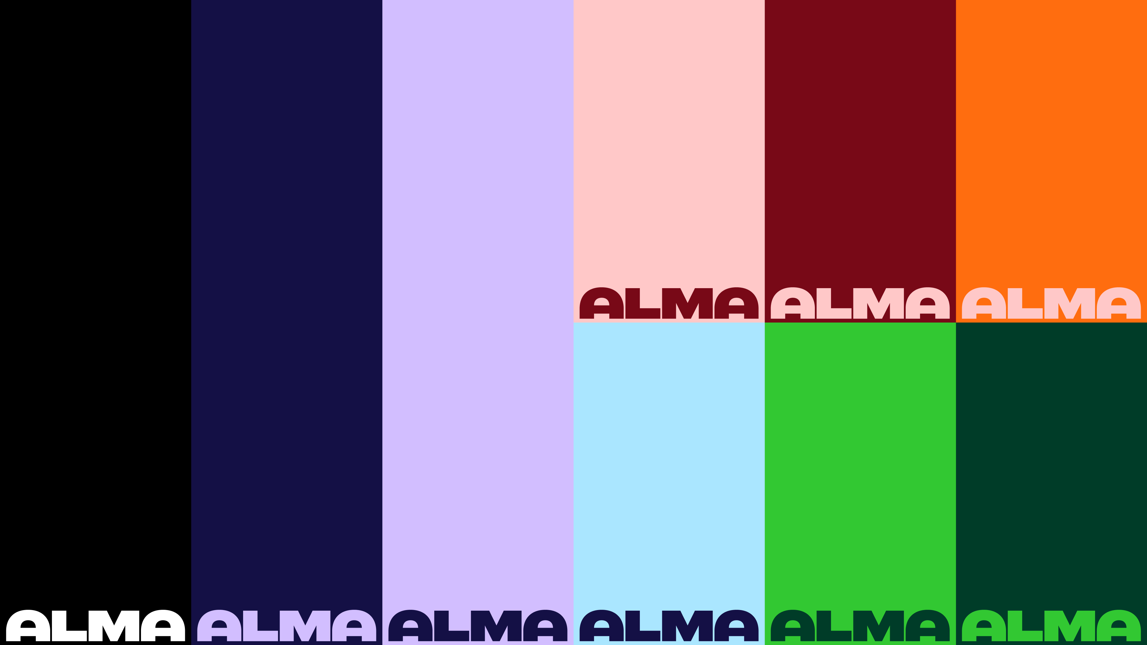
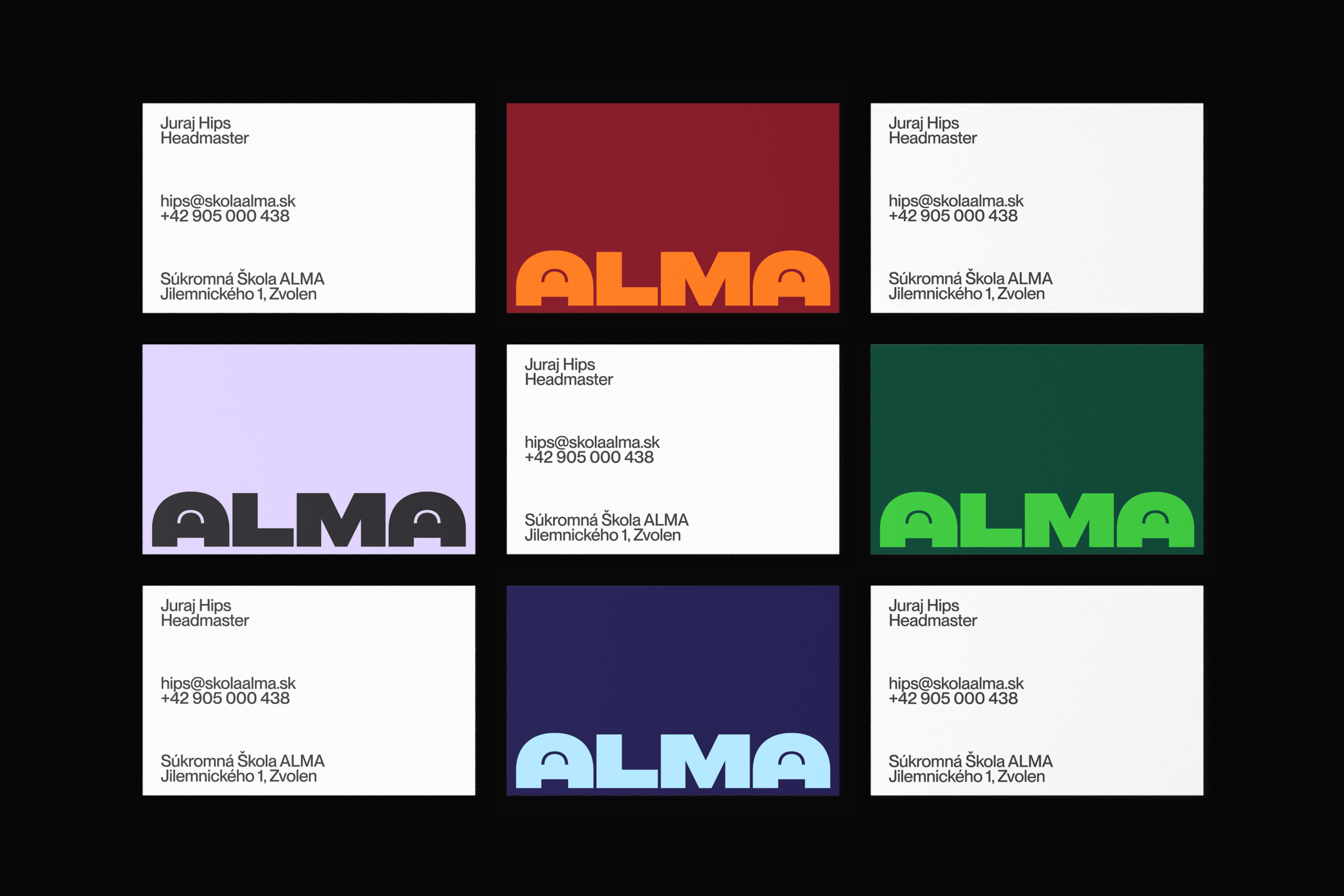
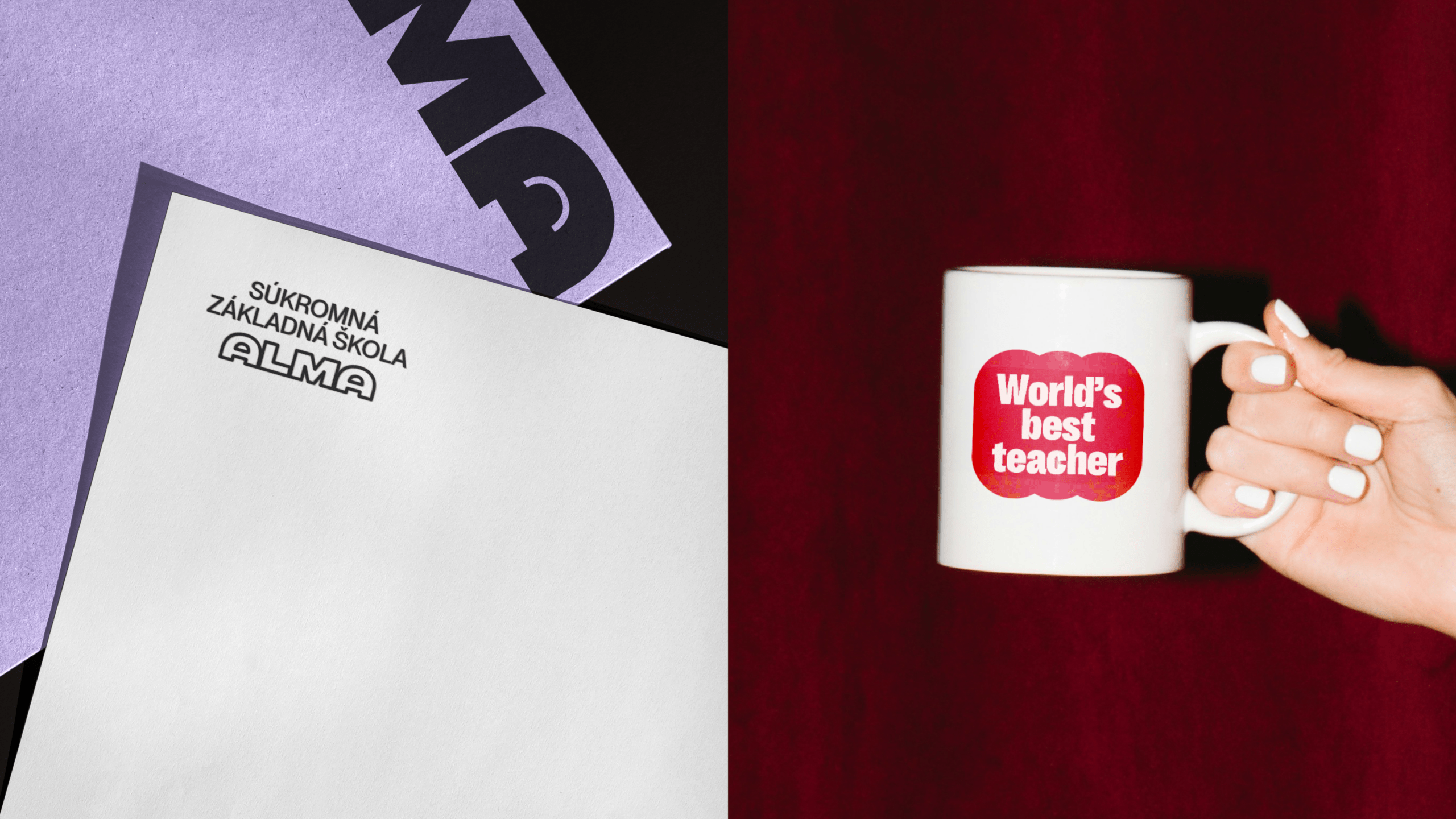
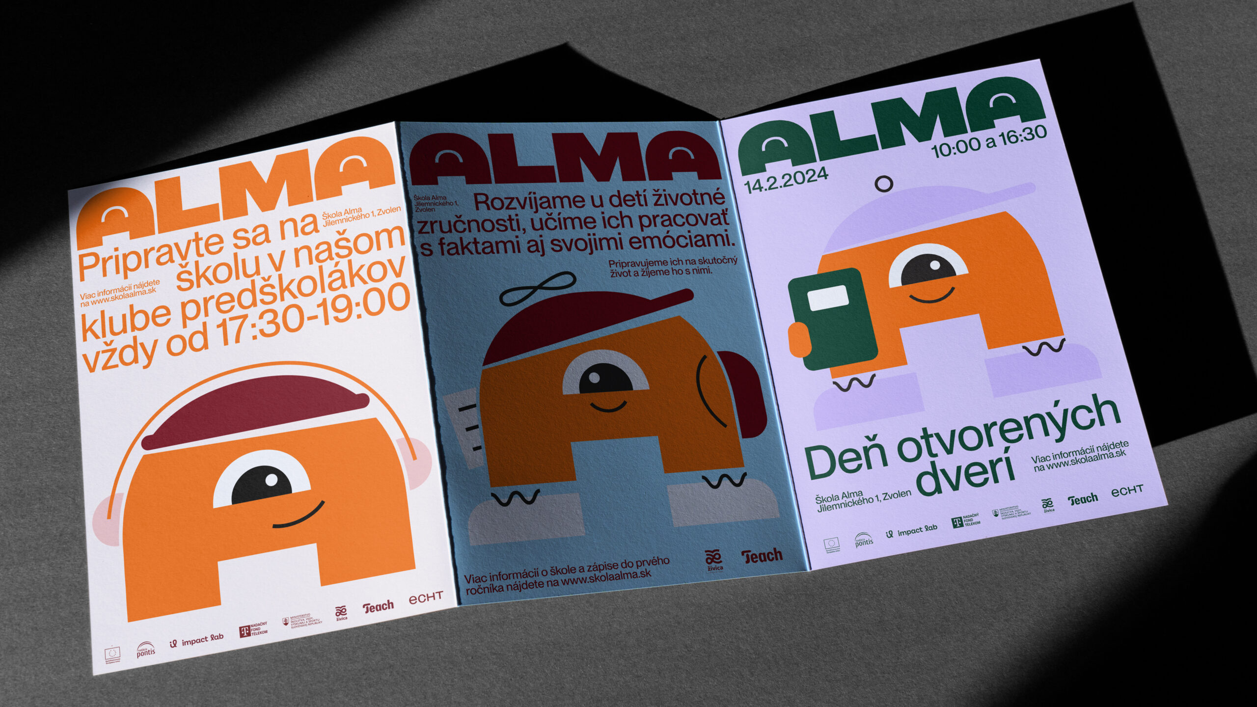
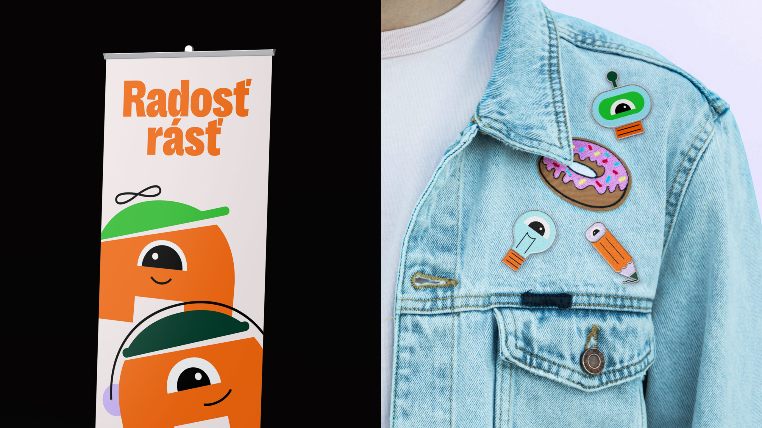
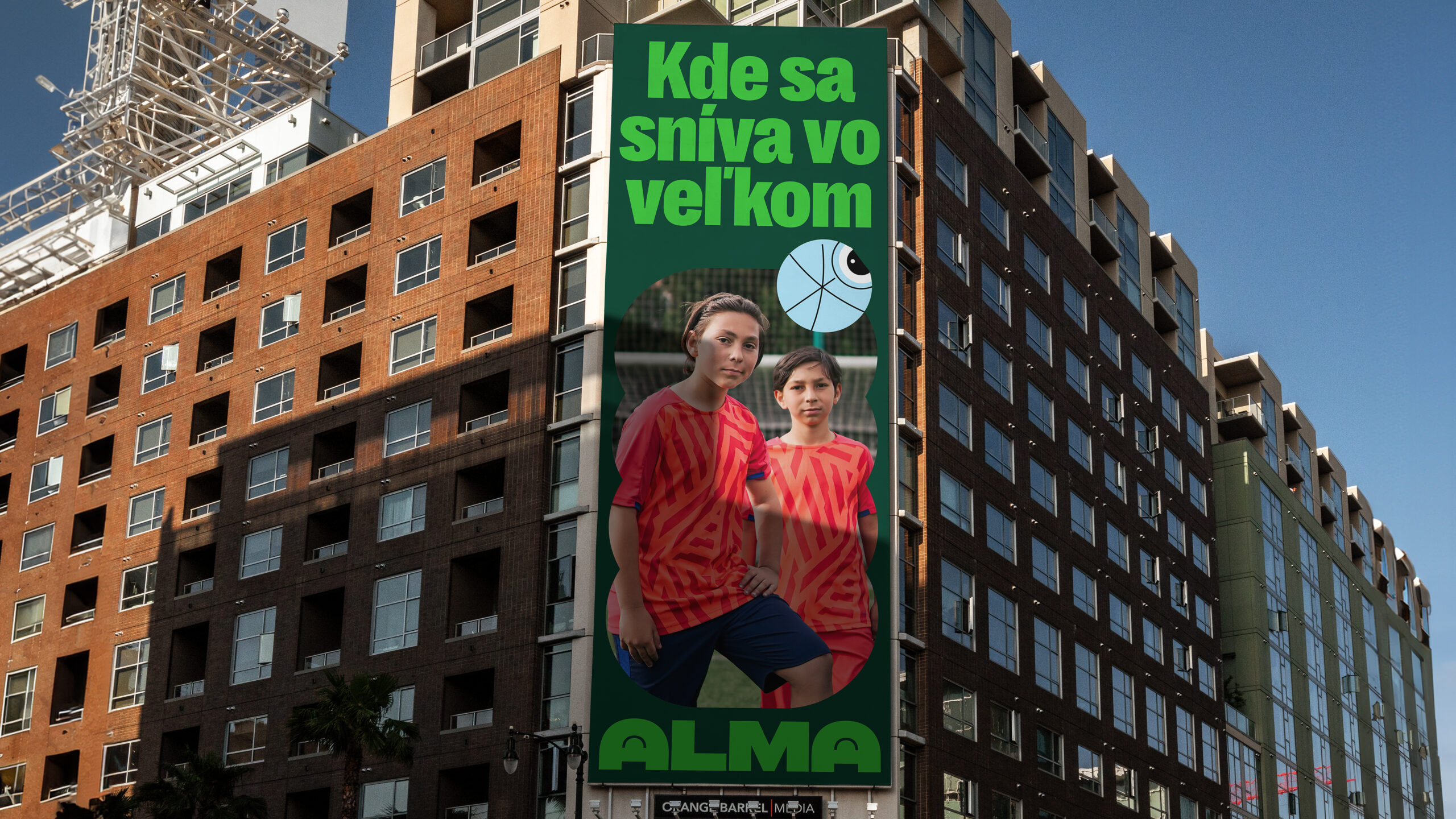
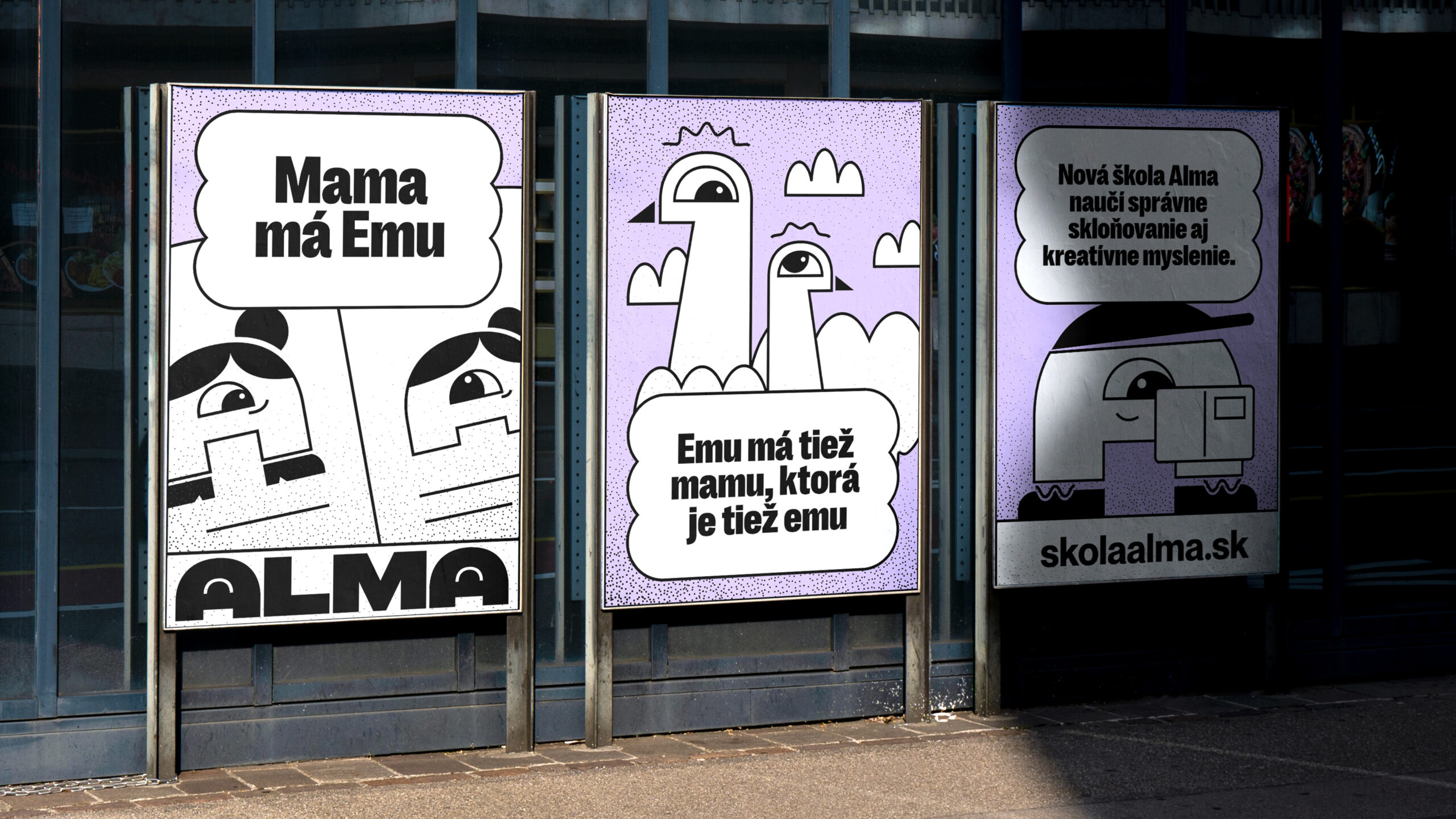
How design helped save an elementary school: The design team faced the most difficult of assignments—to build the brand for an innovative elementary school created by transforming an existing school for children from a segregated community. To open the school, they needed to fill two classes in a short amount of time, so the visual identity had to make an immediate impact. Named Alma, the school’s communication concept was the ‘Joy of Growing’. The identity was designed modularly to resonate with various target groups, including pupils, parents, teachers, and the local government. Central to the identity is the letter ‘A,’ which serves as a cheerful mascot for younger students and fosters creativity and collaboration among older ones. How did the redesign work? Despite an anti-campaign, Alma generated substantial interest, successfully enrolling two full classes of new students.



Related works

eRover – Guardian of the Invisible Shield between Toxic Sludge and Groundwater

MSS99 – Modular Shining System 99