Lucia Mišeková: Working With Type Doesn’t Have To Be Difficult

Lucia Mišeková (2000) is a graduate of the Graphic Design Studio at Tomas Bata University in Zlín. As part of her diploma thesis, she explored the role of typography in the digital age and created the periodical TYPE(A) IN (2024), thanks to which she succeeded in the international competition of bachelor and diploma theses Graduation Projects 2024 in Cieszyn, Poland. In addition, the periodical was also nominated for the Czech National Student Design Award, and it was also presented at the Design Festival in Łódź and at the Slovak Design Award 2024 exhibitions in Bratislava and Košice.
In the latest 23rd year of the international Graduation Projects competition, 380 works from the field of graphic and industrial design were submitted, out of which
thirty best were selected, including your project TYPE(A)IN. Did it fulfil your expectations?
I was very surprised, and I will sincerely say that I did not expect it. When one sees the number of submitted works and their quality, it pleases them to even participate in such a show. Moreover, I was elated when mine suddenly appeared among the best thirty. I was very happy about it, and at the same time, it confirmed to me that I had chosen the right topic relevant today.
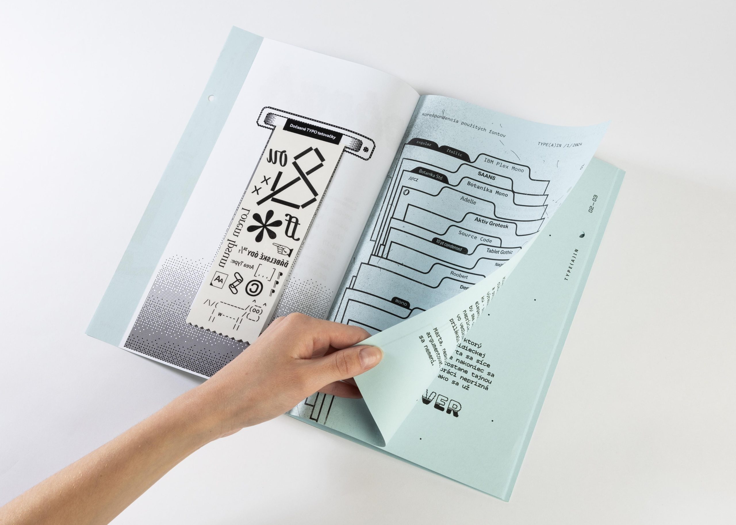
TYPE(A)IN is a periodical focused on typography and graphic design. You created it as part of your diploma thesis in Pavel Noga’s Graphic Design Studio. When did
the impulse arise for you to work on this topic?
It wasn’t one specific moment, as I have had a positive relationship with typography for a long time. This environment is familiar to me because I like working with type; it’s my visual language that I often use in my work.
At the same time, I have also had a long-term positive relationship with print media, and I knew that it was the topic that I would work on one day. On the other hand, the project is also my self-reflection. At the very beginning, I asked myself what I enjoyed more, whether it was web design or printed typesetting and books.
I discovered I was attracted to both. In addition, as a designer, I reflect that times are moving forward and that everything is shifting to digital. So one day I said to myself I could connect the physical and digital worlds. I decided to approach it by returning to creating physical media and connecting digital-interactive elements to the printed form.
You say that you have been close to typography for a long time. Do you recall the moment when typography first caught your attention and you began to develop a relationship with it as a designer?
It happened when I was still in the second grade of elementary school. Even then, I was around all kinds of artists and graffiti artists, and I looked at different forms of type. I remember drawing lettering and graffiti in notebooks and thinking about how type could be approached. After these first impulses, there was high school — I graduated from the ŠUP in Košice where my interest in typography naturally deepened. As part of my graphic design studies, I was surrounded by teachers who awakened a relationship with type in me, and I began to look at type in a completely different way than before. I understood that it involves rules according to which type is to serve as an attractive whole. I looked at the forms of how to work with it, and thanks to typographic regulations, I saw it more on a professional level.
You called the periodical TYPE(A) IN. Why?
I based it on English — the word “type” means font and “in” refers to trendiness. At the same time, it is a play on words that contains the word “pain”. As a whole, it refers to the fact that type does not have to represent pain for designers, and at the same time, that the magazine responds to current trends in typography.