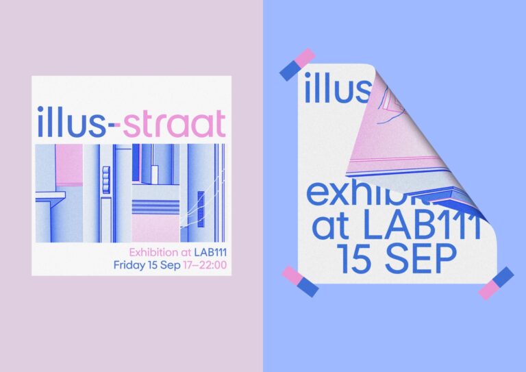
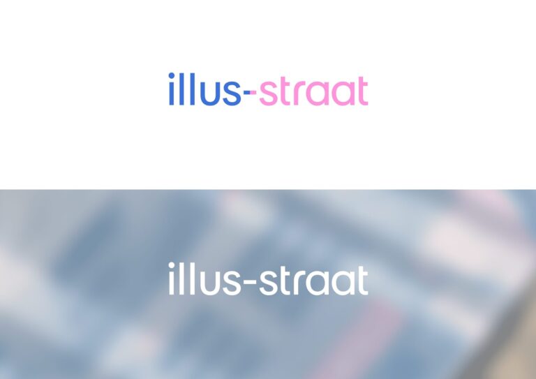
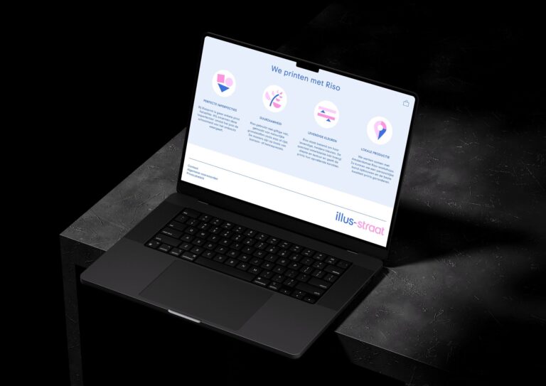
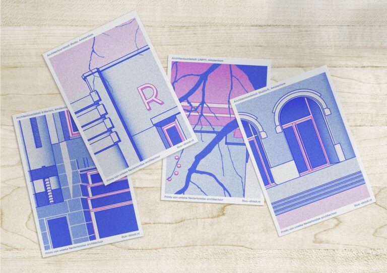


illus-straat
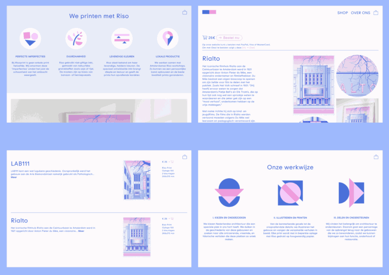
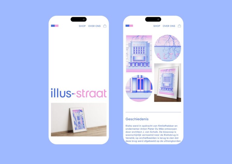
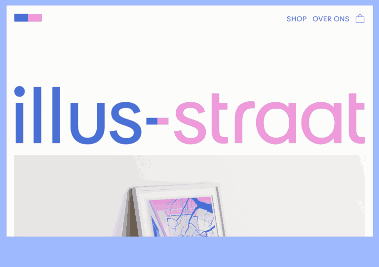
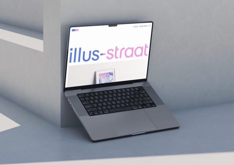
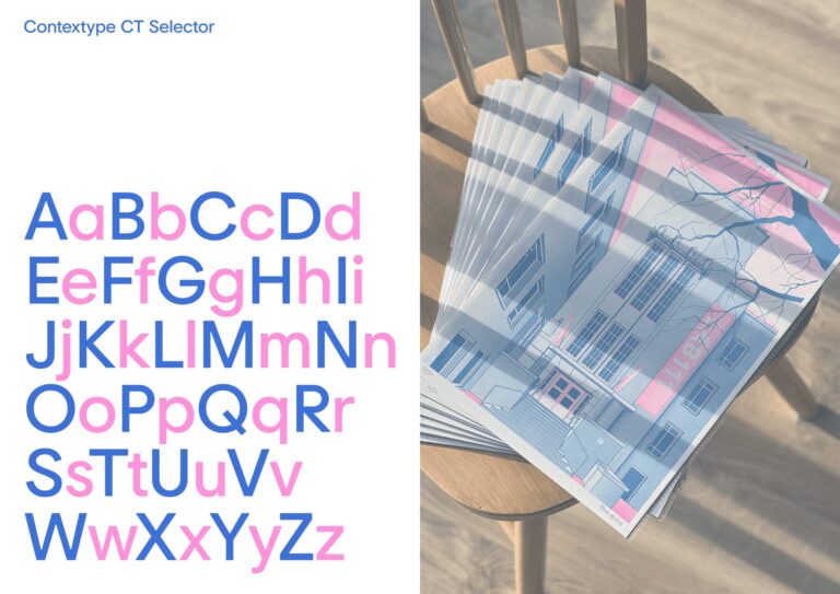
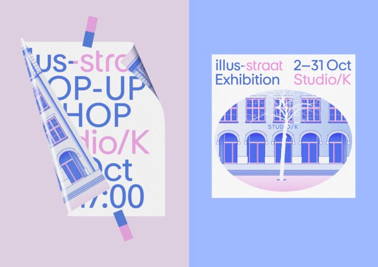
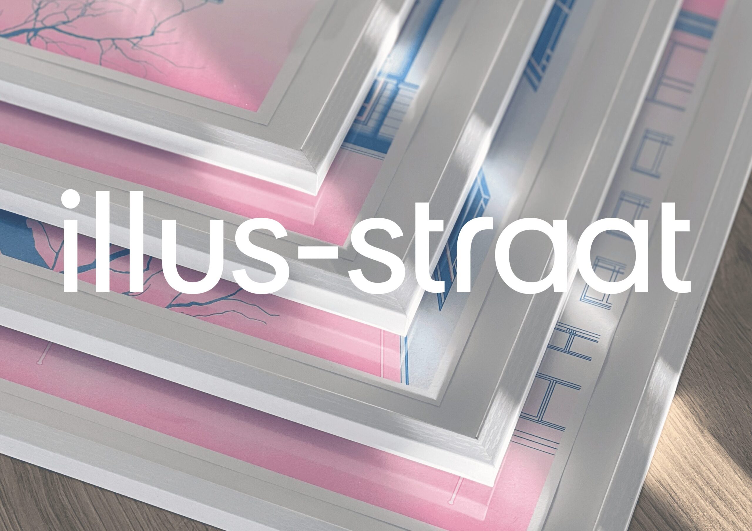
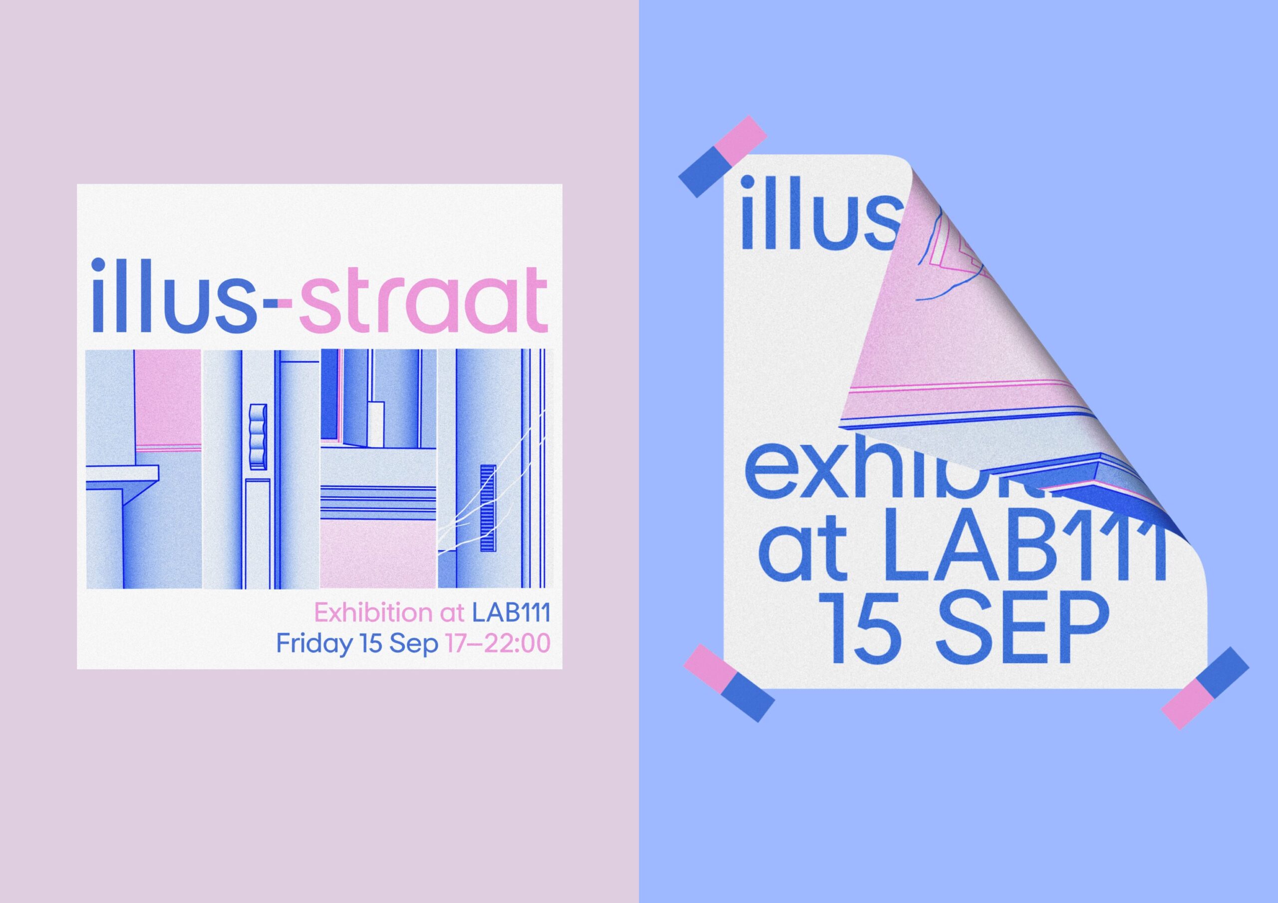
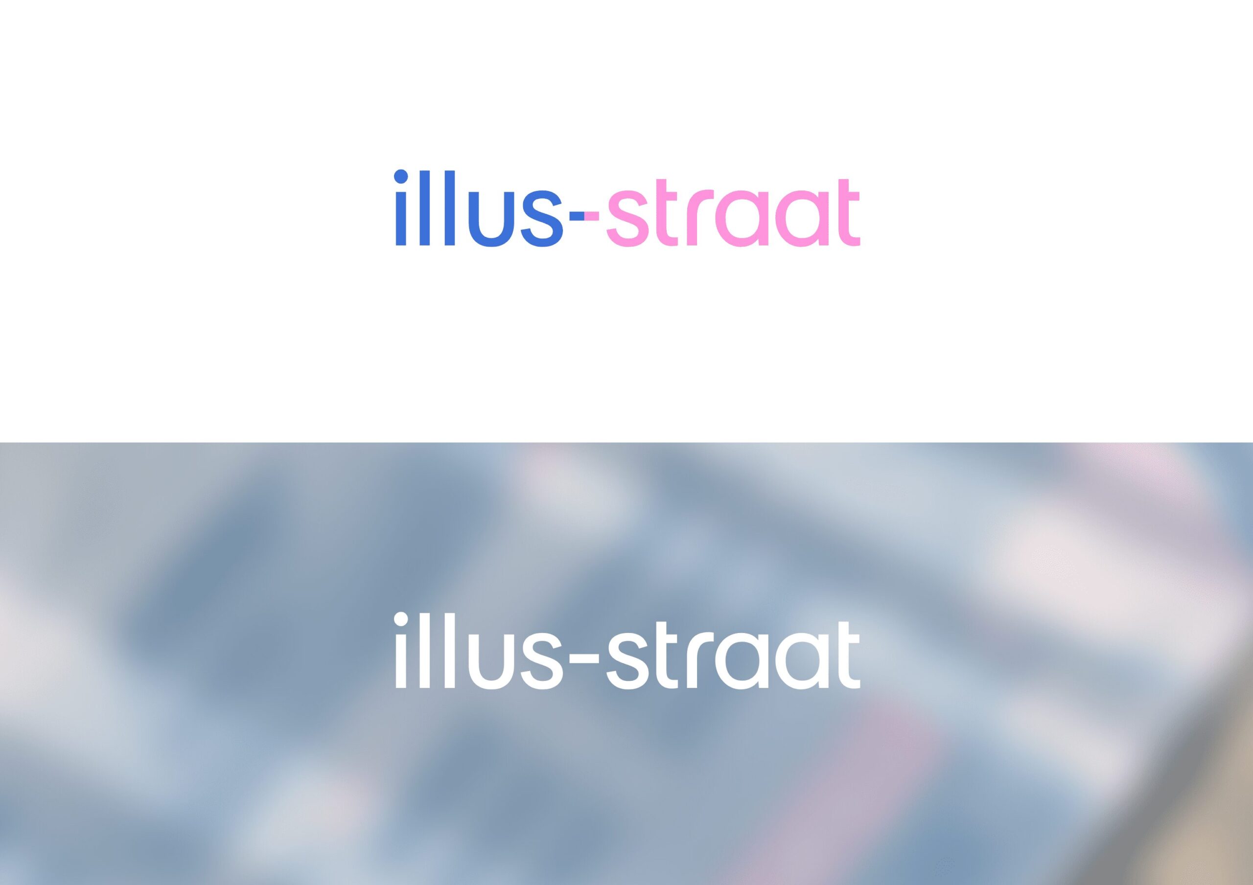
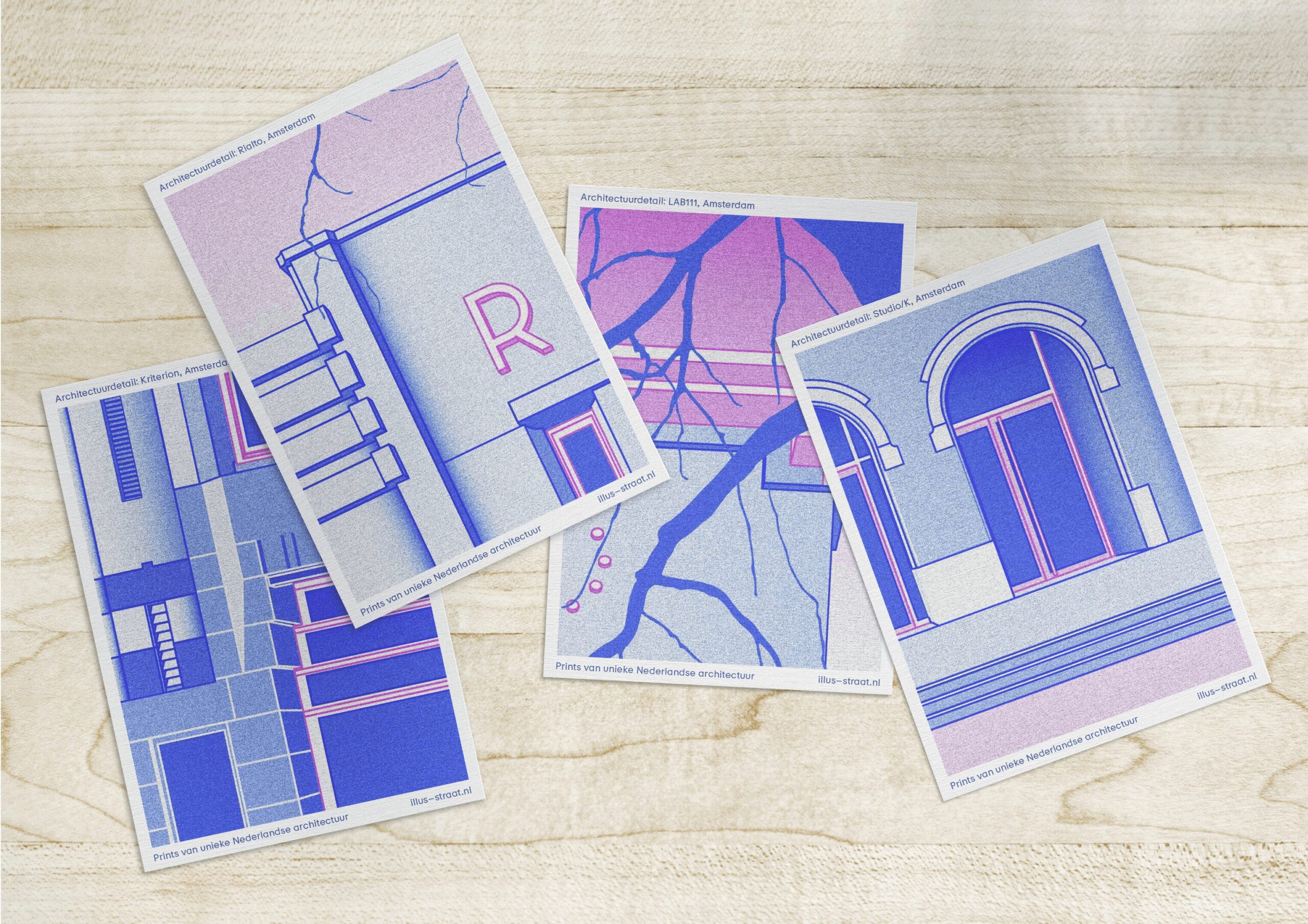
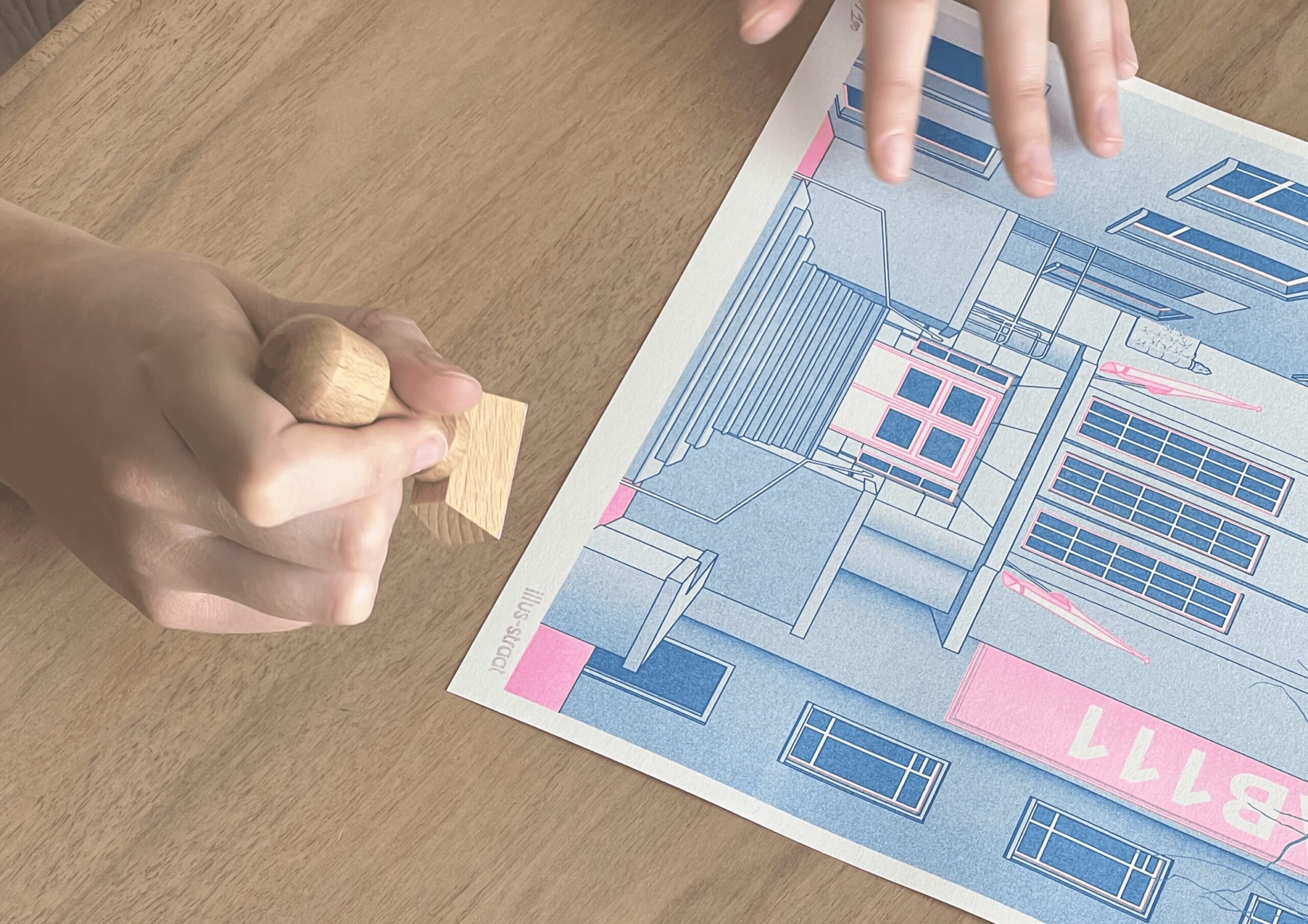
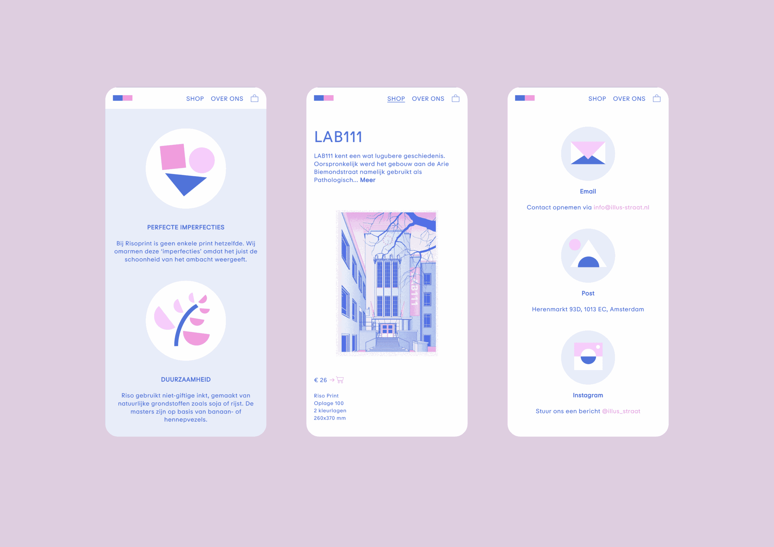
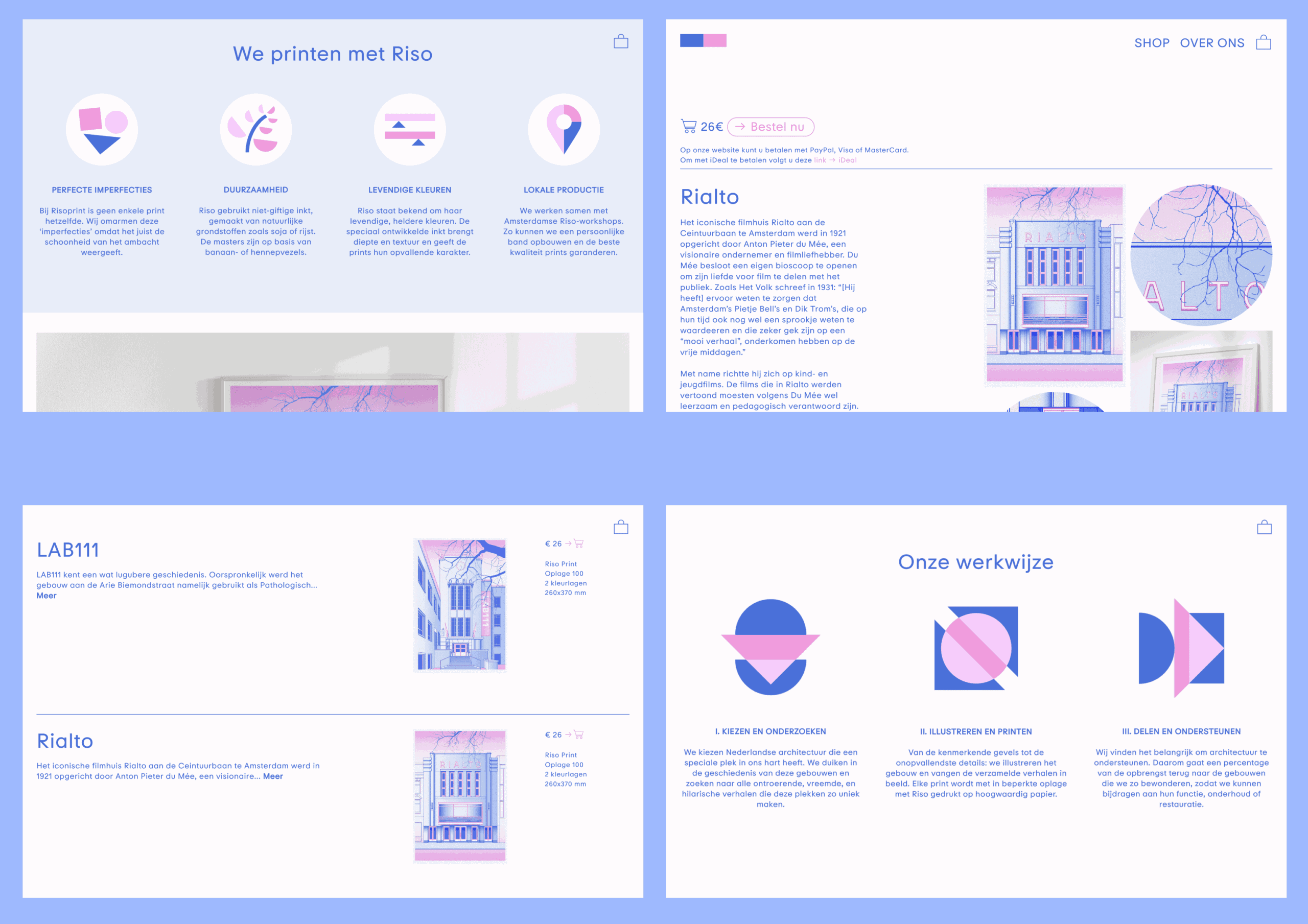
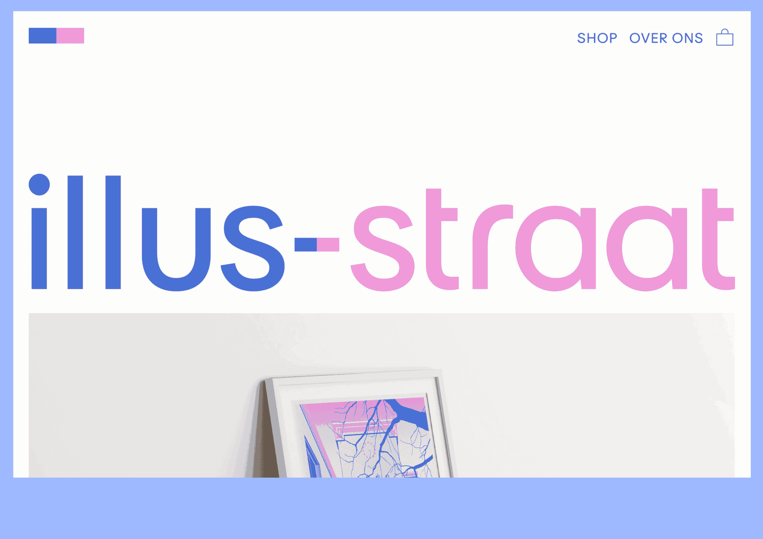
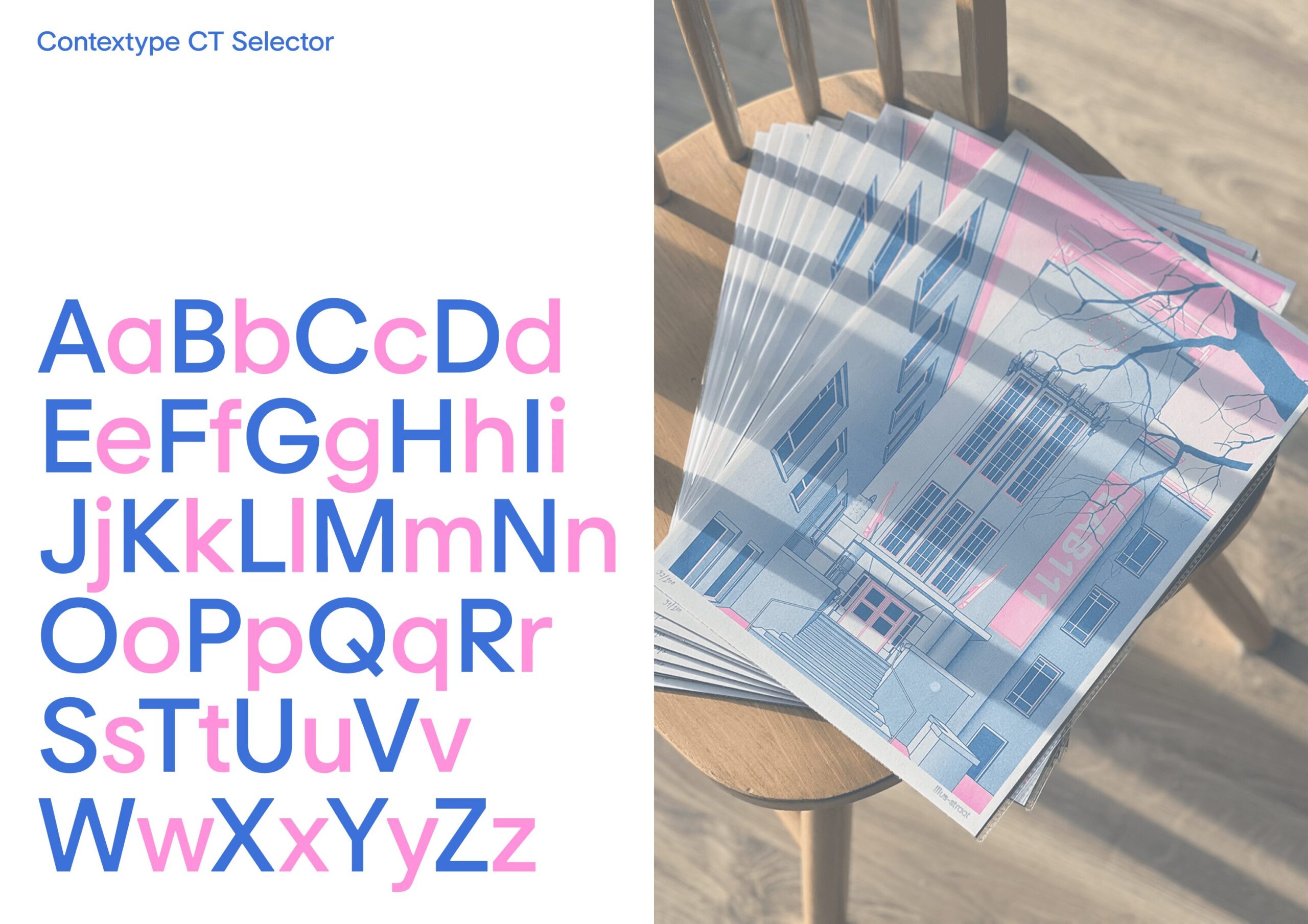
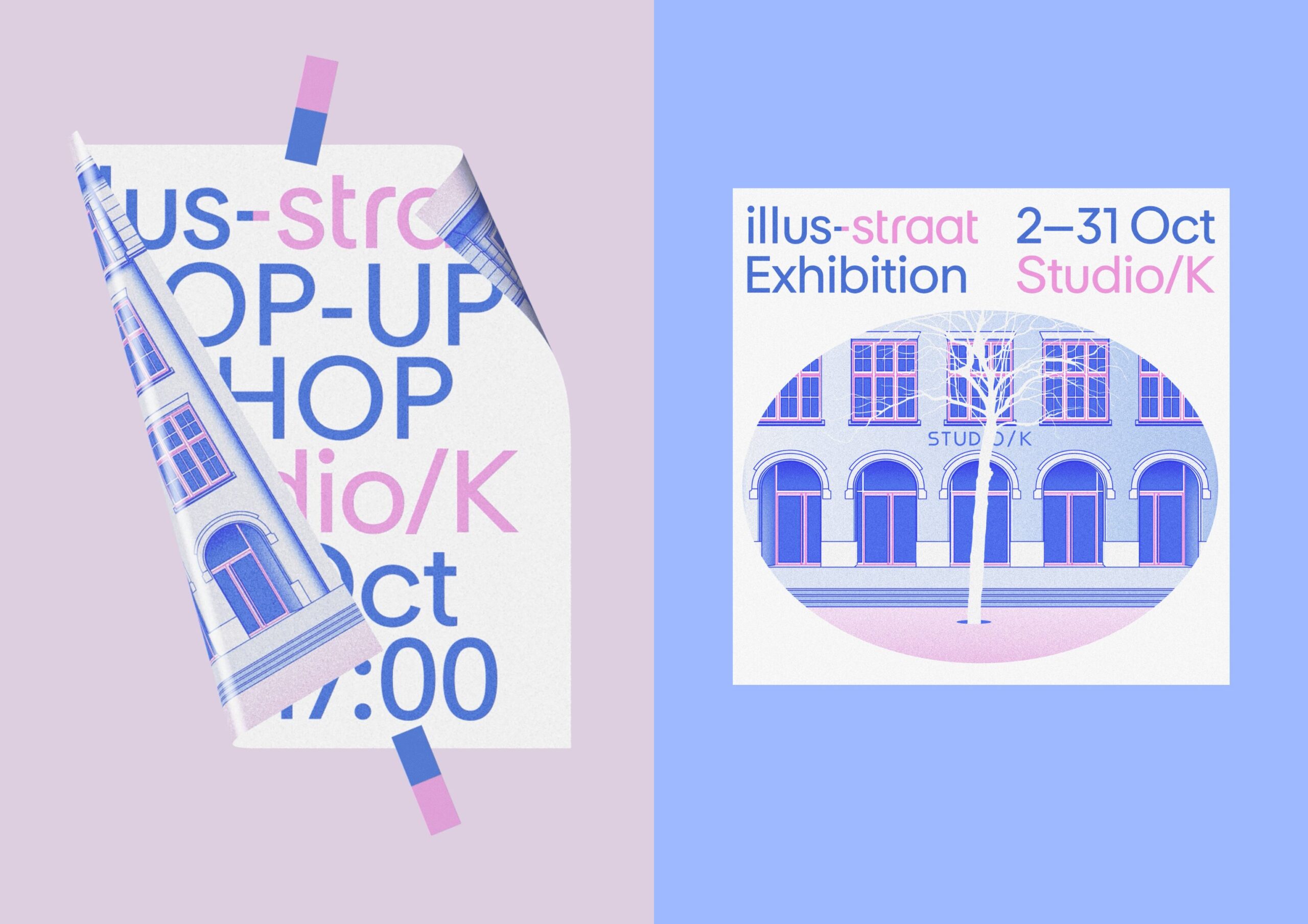
Visual identity, communication strategy creation, and user experience (UX) and user interface (UI) development for illus-straat, a platform dedicated to capturing unique Dutch architecture. The platform engages in historical research, produces risographs, organizes exhibitions, and administers an architecture grant. The brand design features a simple representation of the words “illus-straat” in a blue-pink color scheme. The hyphen between the words symbolizes a brick, establishing a connection with the architectural aspect of the project. This hyphen is also utilized in various communications, such as posters, photographic materials, and interactive animations. The color combination is consistently applied across all presentation materials, the website, risograph illustrations, and social media communication. All text is set in Contextype’s CT Selector typeface.


Related works

eRover – Guardian of the Invisible Shield between Toxic Sludge and Groundwater
MSS99 – Modular Shining System 99