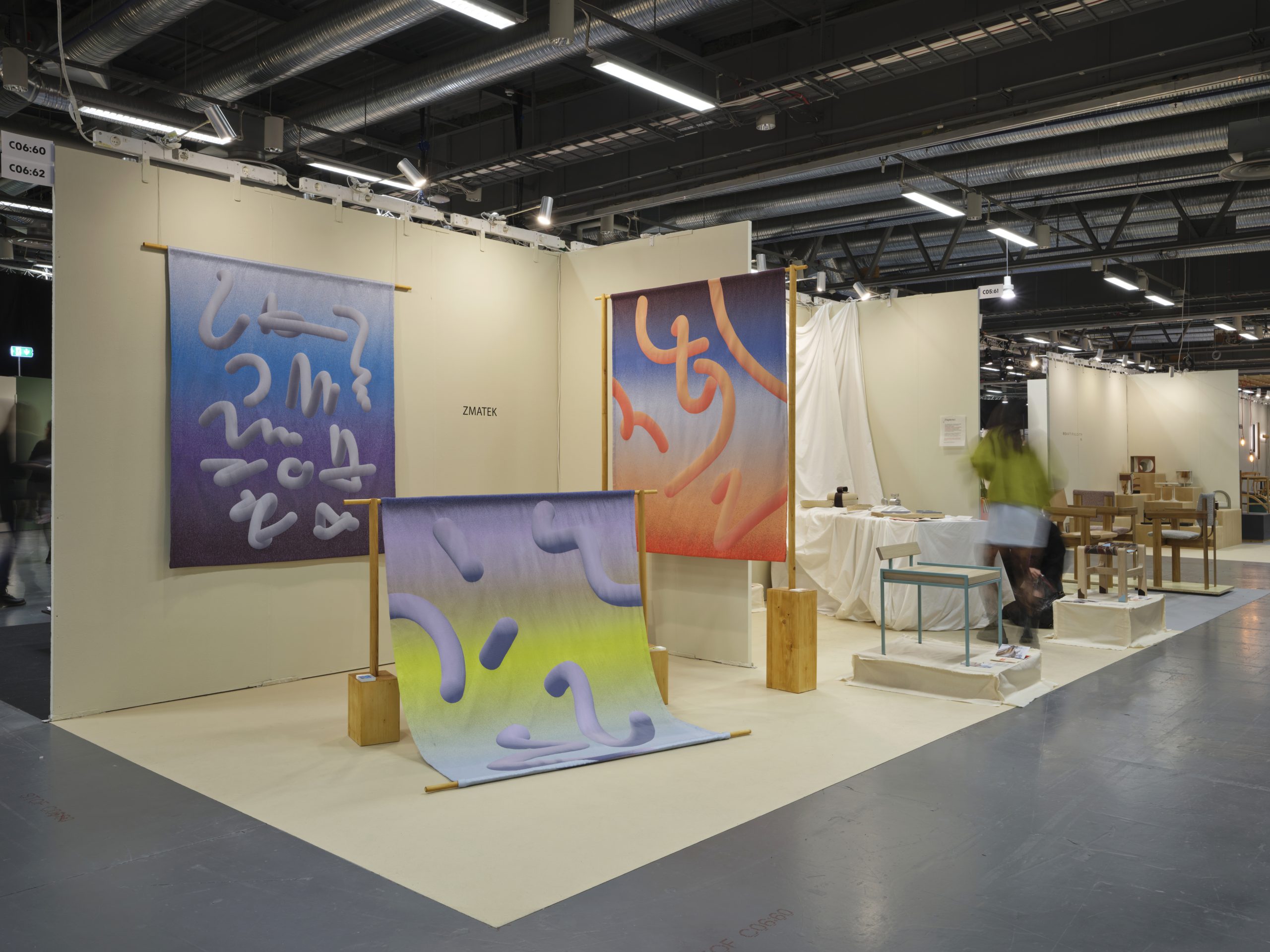
Zuzana Zmateková’s In-between Fabric Collection. Combining Digital Aesthetics and Traditional Technique

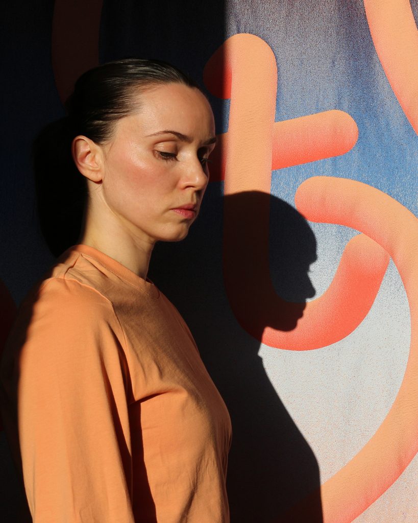
Zuzana Zmateková (1989) is a textile designer and a graduate of the Master’s program in Fashion, Clothing and Textile Design at the Aalto University School of Art, Design and Architecture in Helsinki. In addition to commissioned work, she also works on her own experimental projects, in which she has long been interested in digital aesthetics and the overlap of new media in textile design. In her latest project, In-between (2024), she created a collection of wall tapestries using the traditional jacquard weaving technique, inspired by the “digital-real” phenomenon that connects the digital and physical worlds in the process of design and artistic creation. She recently presented the project at several shows, including the leading design fair, Stockholm Furniture Fair 2025.
Your project, In-between, is a collection of tapestries in which you connect the digital and physical world and explore the boundaries between them. How did this proj- ect come about?
I started working on the project in 2023, and it is related to the fact that as a textile designer, in addition to commercial textile design, I also work on my own projects. These are mostly of an alternative nature, and in recent years, I have devoted more attention to jacquard weaving in addition to the topic of digital aesthetics. The result was the project In-between, in which I continue to work with digital programs and tools, which means that I create the designs digitally, but transform them into textile form using tradi- tional textile technology.
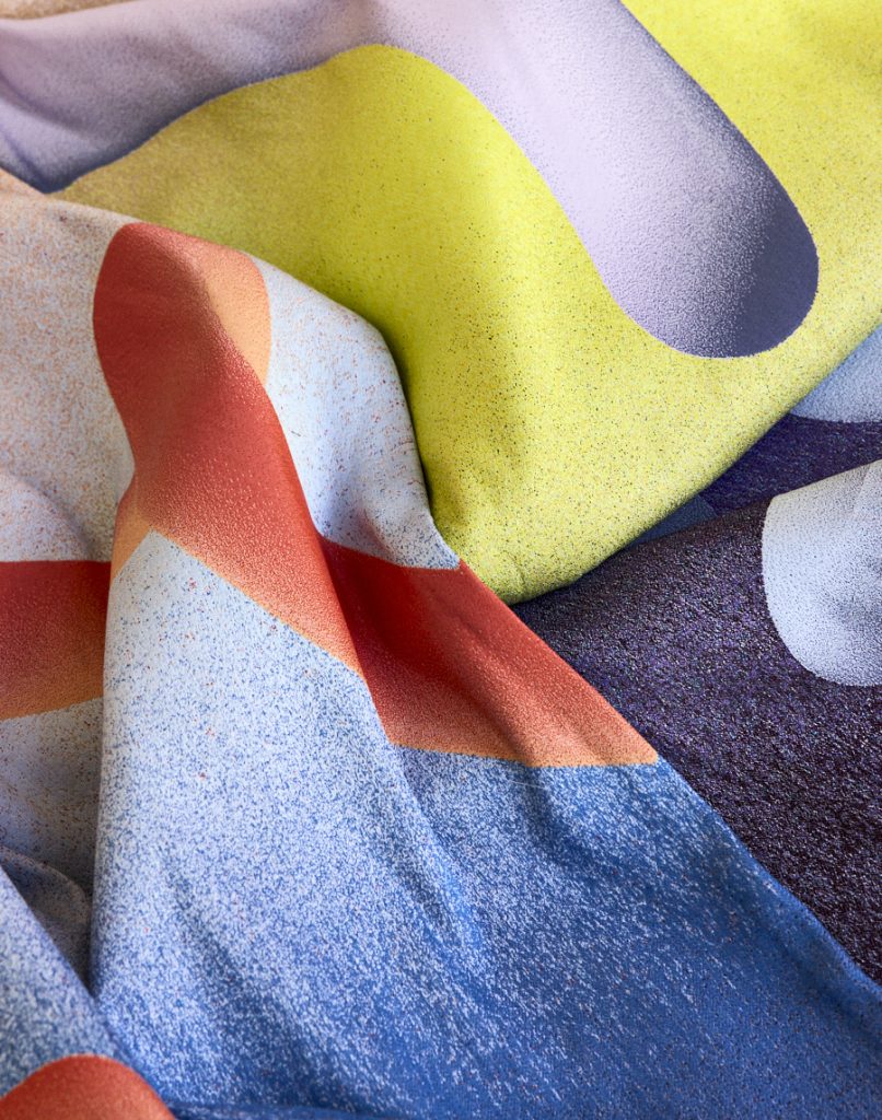
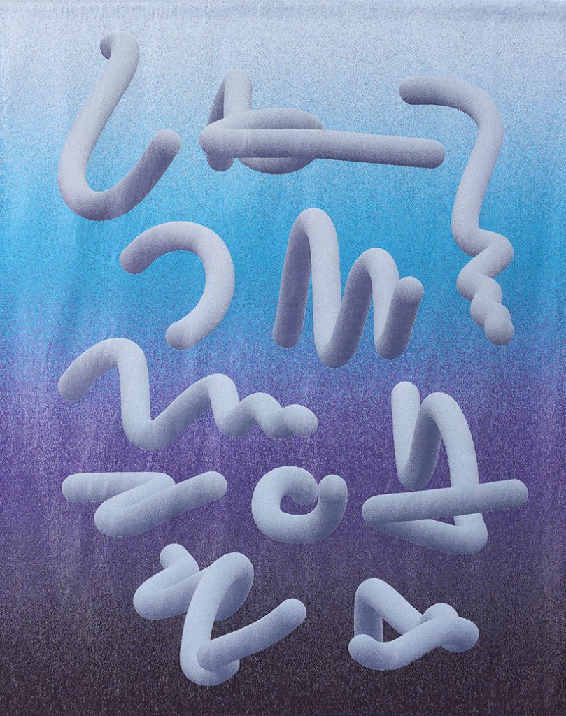
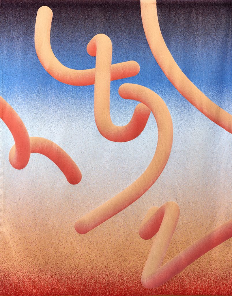
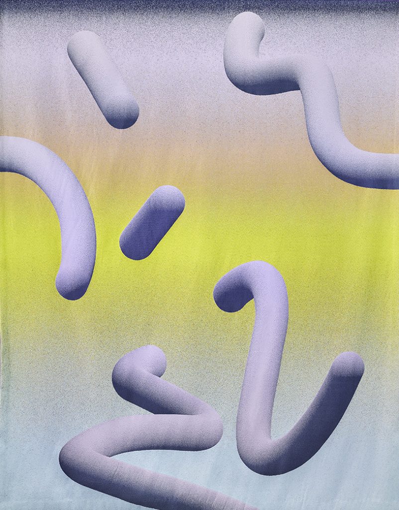
The collection consists of three tapestries with dominant yellow, blue, and orange colors, and each fabric was preceded by color research. How did you proceed with their production?
At first, it was rather chaotic. My goal from the beginning was to create fabrics that would visually reflect trends in digital design and aesthetics. I proceeded by first start- ing with theoretical research. Still, since there were no professional articles published on this topic yet, I focused mainly on visual research, during which I searched for various visual data on the Internet.
Part of this phase included my visit- ing Pinterest, Instagram, and other similar networks and searching for results using the hashtag “digital aesthetics.” This was the right path, as I found a lot of visual material from which I took screenshots. That way, I discovered similar patterns in the digital environment. From this plentitude of visual material, I cre- ated my own categories and digital streams, from which the resulting dominant colours were derived.
Based on what you are saying, it seems like a laborious matter. The first thing that occurred to me was that you were working with a pro- gram, and based on the algorithm, you achieved the results that you continued to work with.
Yes, it was certainly laborious. However, it was quite interesting for me to see how unambiguous the individual streams were. One example was a stream of a specific gamer aesthetic within computer games, characterised by gloomy, dark blue, and green tones. Another so-called beige minimalism stream represented a stream with soft and neutral colors, and finally there was a kind of “candy” stream, which was colorful, playful and combined pastel positive colors.
I finally narrowed down my research to five streams for which I created designs, but due to financial reasons, I only wove three fabrics in the form of colour gradients. I proceeded by defining colour schemes within these streams in the digital aesthetic, each representing a different stream: One fabric is dark and goes from turquoise blue to dark blue, another is light, made up of yellow to pink colours, and then I have the classic sunset with orange tones.