Romboid–Display
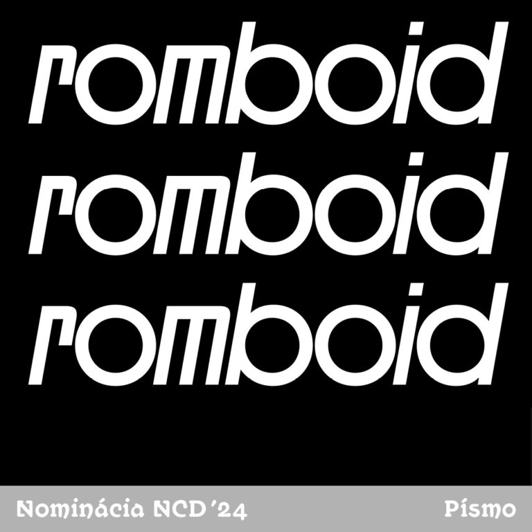
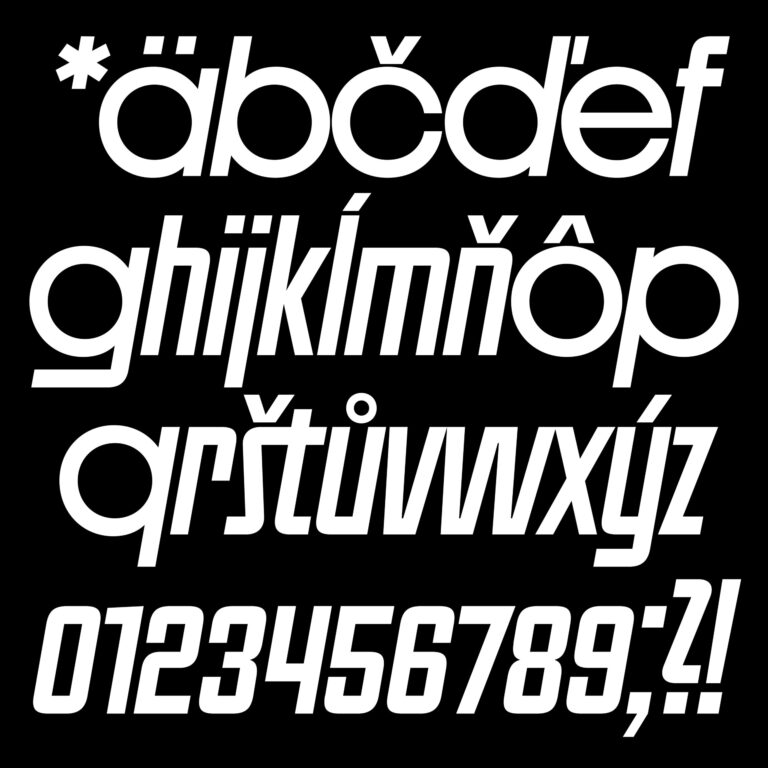
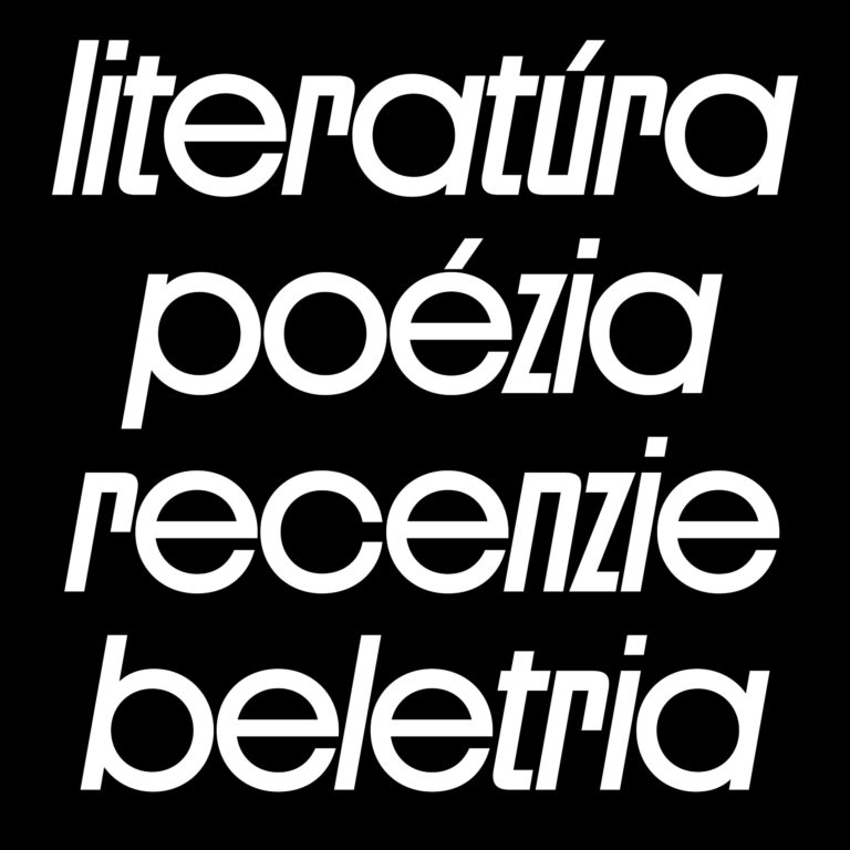
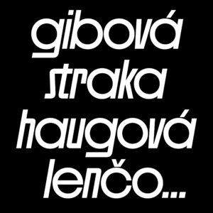
Romboid (a magazine for literature and artistic communication) has undergone a complete redesign, which includes the design of a new logotype in the form of geometric lettering. This was the basis for the design of the display font used in the headlines of the articles. The design applies the geometric principle of the rhomboid by tilting the square shapes, to which the round forms of the rounded letters are contrastingly designed. The typeface contains a single cut with the lower case letters, as a reference to modernist tendencies in art. The character set is limited for use sufficient for the Slovak language with the potential for further additions.
Zdieľať dielo:
Related works

eRover – Guardian of the Invisible Shield between Toxic Sludge and Groundwater
Stanislav ZEMAN
Eva Mária Kaprinayová
MSS99 – Modular Shining System 99
Alexander Kupko
Viliam Zajíček
Dalibor Špilák
Bestiary
Zuzana Vrábeľová
