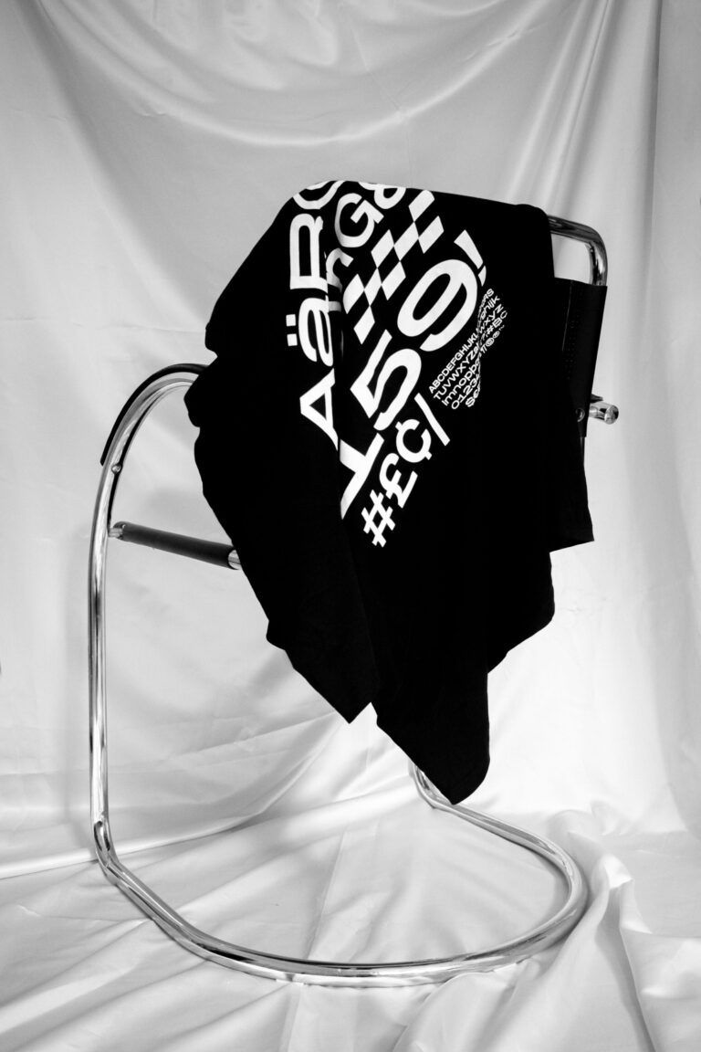
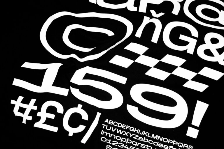
Robust Grotesk

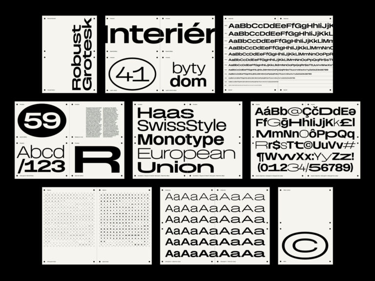
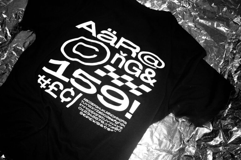
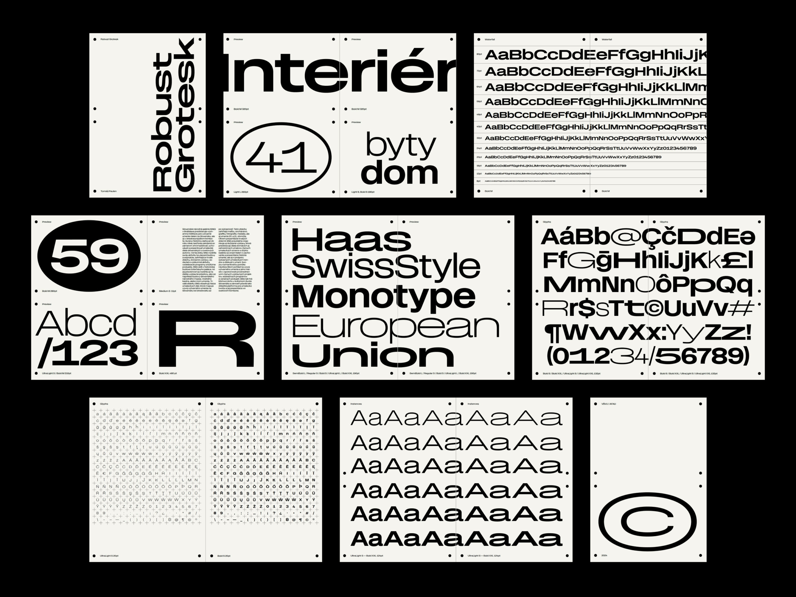
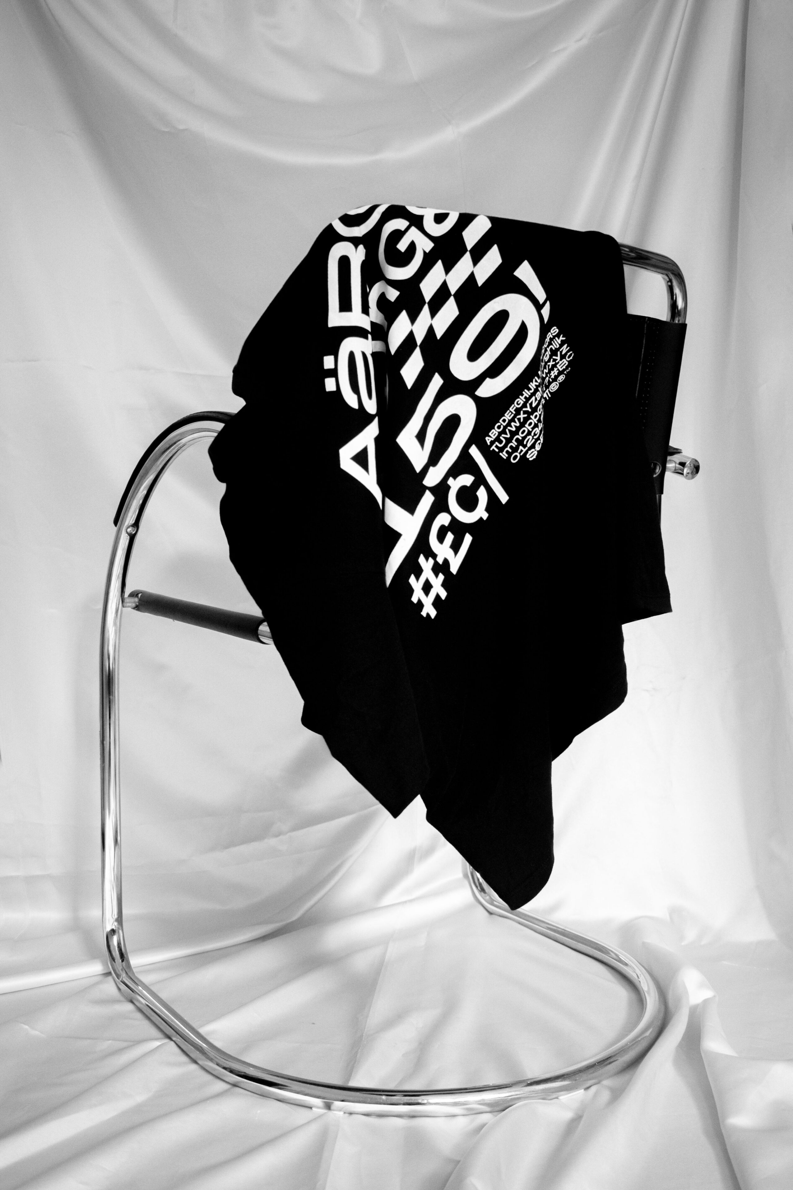
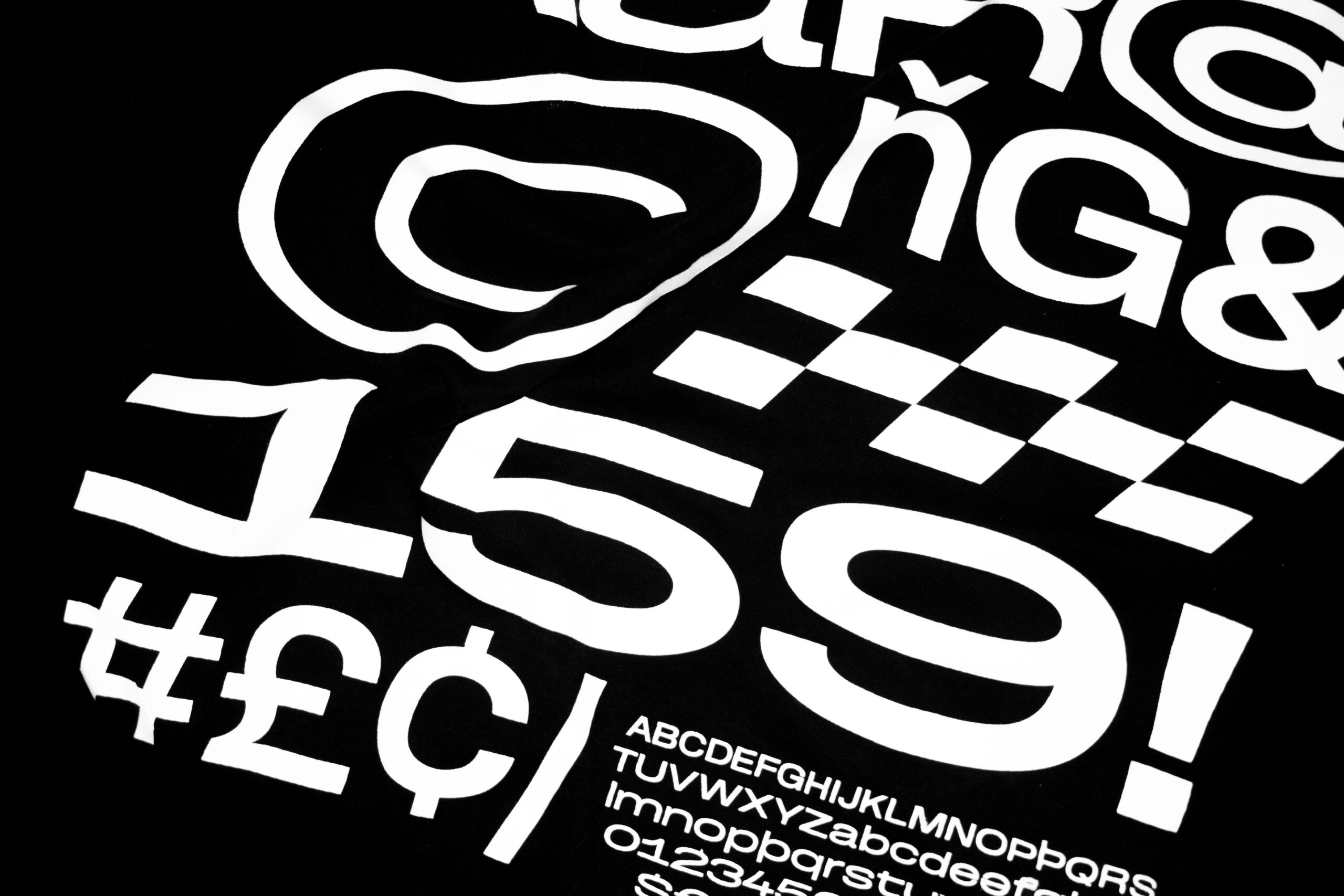
The Robust Grotesk typeface is a semester project from Typolab studio, inspired by Swiss grotesque sans-serifs. As its name suggests, it draws its inspiration from the grotesque sans-serif typefaces of Swiss traditional typography. It combines a nostalgic, brutalist touch with contemporary forms. In its expression, it is rational, neutral, technical and, at the same time, very robust. It is characterized by wide characters and tall lower-case letters, which makes it readable even in small sizes and allows narrow leading in typesetting. It is variable on two axes in darkness from UltraLight to Bold and in width from S to XXL. The typeface contains 30 static styles as well as a fairly wide range of characters, diacritics and symbols.
NCD ročník:
Slovak Design Award 2024
NCD kategória:
Student Design
Hodnotenie:
Exhibited Works
Zdieľať dielo:

Related works
eRover – Guardian of the Invisible Shield between Toxic Sludge and Groundwater
Stanislav ZEMAN
Eva Mária Kaprinayová
MSS99 – Modular Shining System 99
Alexander Kupko
Viliam Zajíček
Dalibor Špilák
SOAP BUBBLE
Patrik Illo